
Cosmetic Packaging Dielines: What They Are and How to Use Them
Cosmetic packaging dielines translate digital designs into production-ready files by defining cut lines, bleeds, safe zones, and decoration methods to prevent costly misprints and regulatory issues.
For an independent beauty brand founder, the transition from a finished laboratory formula to a physical, shelf-ready product is filled with technical hurdles. You have spent months refining active concentrations, selecting the perfect glass dropper bottles, and perfecting your brand’s visual identity in design software. Yet, the moment you prepare to send your artwork to a packaging manufacturer, you are asked for a flat, multi-colored vector file known as a dieline.
A dieline is the critical bridge between digital design software and physical factory reality. It is the technical document that translates your creative intent into a precise set of instructions that a machine can cut, print, fold, and wrap around a real container. Working within a dieline correctly is the single most important step in preventing expensive misprints, crooked labels, or disastrous production delays that can drain your launch budget.
What Is a Cosmetic Packaging Dieline?
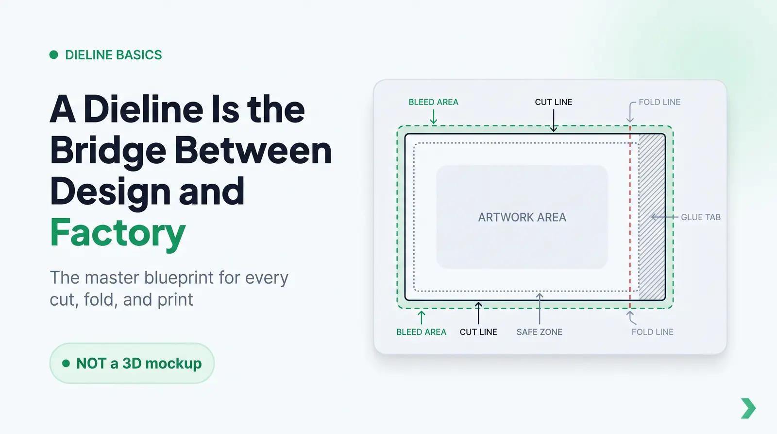
In the packaging and printing industries, a dieline is a two-dimensional technical template that outlines the exact flattened layout of a physical package [1]. It serves as a structural blueprint, marking the precise locations of cut lines, fold lines, bleed areas, safe zones, and adhesive tabs before the packaging material enters production. Unlike a three-dimensional mockup or a digital render, which are used primarily for aesthetic visualization, a dieline is a highly precise, mathematically defined vector document used directly by manufacturing machinery to guide the physical processes of printing, cutting, and assembly [2].
An authoritative packaging guide from Admiral Packaging notes that a dieline is a functional part of how the package performs, acting as the master blueprint that defines where graphics, logos, and regulatory information will appear once the material is cut, folded, or sealed [3]. For cosmetic brands, a dieline might represent the flat layout of a folding carton box, the wrap-around surface of a pressure-sensitive label, or the cylindrical extrusion of a flexible plastic tube.
The Anatomy of a Dieline: Every Line Has a Job
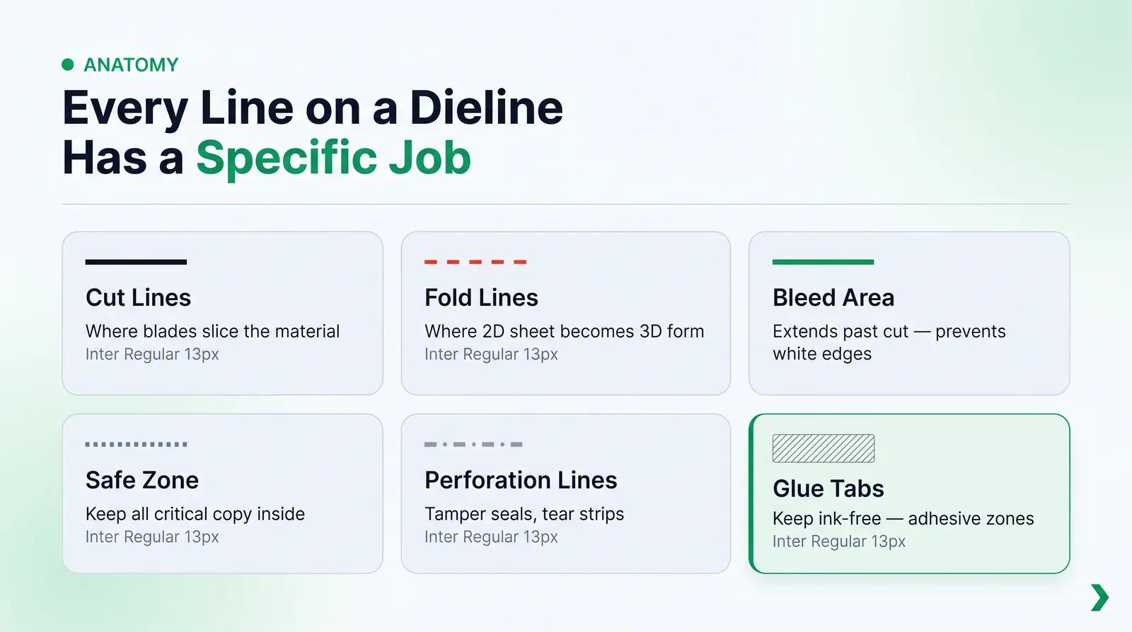
When you first open a dieline file in vector design software like Adobe Illustrator, it often resembles a complex, multi-colored roadmap. Every line and color on a professional dieline has a specific manufacturing job. Understanding this anatomy is essential for any designer or brand founder preparing print-ready files.
Cut Lines (Trim Lines)
Typically represented as solid black or solid red lines, cut lines indicate the exact boundary where the die-cutting machine’s steel blades will slice the material [1]. The space enclosed by the cut lines represents the exact physical dimensions of your finished package or label once it is trimmed and separated from the production sheet.
Fold Lines (Crease Lines)
Shown as dashed or solid red lines, fold lines indicate where the packaging material will be creased and folded to transition from a flat 2D sheet into its final 3D form [1] [2]. On folding cartons, these lines represent the edges of the box panels. On primary labels, they may represent the corners of a square bottle or the overlap point of a wrap-around label.
Bleed Area
The bleed area is the extra design space that extends beyond the physical cut line, typically marked by a solid green or blue outer boundary [1] [2]. Because industrial printing and cutting machines experience slight mechanical shifting during high-speed runs, extending your background artwork, colors, and patterns into the bleed zone ensures that no unwanted white paper edges or unprinted gaps appear at the borders of your finished product.
Safe Zone (Live Area)
Marked by dotted green or blue lines, the safe zone is the protective boundary situated inside the cut lines [1] [2]. All critical graphic elements, including brand names, product titles, usage directions, and mandatory regulatory copy, must remain strictly inside this boundary. If a design element is placed too close to the cut line, even a minor mechanical shift during production can cause that element to be sliced off or visually distorted.
Perforation and Score Lines
Often represented as alternating dot-and-dash lines, perforation lines indicate where the material will be partially cut or punched [1]. This is common for tamper-evident seals on cosmetic boxes, tear-away strips, or easy-opening tabs on shipping mailers.
Glue Tabs (Seal Tabs)
Represented by hatched or shaded regions, glue tabs show exactly where industrial adhesives will be applied during assembly [1] [2]. These zones must be kept completely free of ink, varnishes, or laminates, as printing finishes prevent adhesives from bonding securely, which can cause your boxes to fall apart on retail shelves.
Why Cosmetic Packaging Dielines Are Different from Flat-Pack Dielines
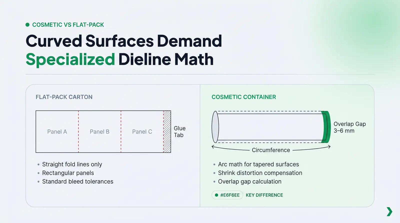
Most general packaging guides explain dielines using the classic cereal box analogy, where a flat sheet of cardboard is folded along straight lines to form a rectangular prism. However, cosmetic primary packaging (such as bottles, jars, tubes, droppers, and airless pumps) operates in a completely different structural dimension. Primary cosmetic containers are dominated by curved, cylindrical, conical, or highly irregular three-dimensional surfaces.
FLAT-PACK DIELINE (Cartons, Boxes)           ROUND COSMETIC CONTAINER DIELINE (Labels, Sleeves)
+-----------------------------------+        +-----------------------------------------------+
|   Panel A   |   Panel B   |Panel C|        | ~~~~~~~~~~~~~~~~~~~~~~~~~~~~~~~~~~~~~~~~~~~~~ | <--- Top Bleed
|             |             |       |        |-----------------------------------------------| <--- Top Cut Line
|  (Straight  |  (Straight  | (Glue |        | . . . . . . . . . . . . . . . . . . . . . . . | <--- Top Safe Zone
|   Folds)    |   Folds)    | Tab)  |        |                                               |
|             |             |       |        |           PRINCIPAL DISPLAY PANEL             |
|             |             |       |        |                                               |
|             |             |       |        | . . . . . . . . . . . . . . . . . . . . . . . | <--- Bottom Safe Zone
|             |             |       |        |-----------------------------------------------| <--- Bottom Cut Line
+-----------------------------------+        | ~~~~~~~~~~~~~~~~~~~~~~~~~~~~~~~~~~~~~~~~~~~~~ | <--- Bottom Bleed
                                             +-----------------------------------------------+
                                              <----------------- Circumference ------------->
This structural reality introduces several unique challenges that do not exist in flat-pack carton design.
Wrap-Around Labels and the Overlap Gap
When designing a pressure-sensitive label that wraps completely around a cylindrical cosmetic bottle, your dieline is not just a simple rectangle. It must account for the circumference of the bottle plus an overlap gap, typically 0.125 inches (3 mm) to 0.25 inches (6 mm). This overlap ensures that the label can adhere to itself securely. If your dieline does not include this precise calculation, the label edges may fail to meet, exposing the container underneath, or they may overlap too far, covering critical brand copy.
The Physics of Tapered and Conical Containers
Many cosmetic jars, lip balm tubes, and double-walled bottles feature a subtle taper, meaning the container is wider at the top than it is at the bottom. If you attempt to apply a standard rectangular label to a tapered container, the label will inevitably crease, bubble, or slant downward, resulting in a highly unprofessional, wrinkled appearance [4].
To label a tapered surface successfully, the dieline must be designed as a mathematically calculated arc [5]. This curved dieline compensates for the gradual change in the container’s diameter, allowing the flat label to wrap smoothly and appear perfectly straight once applied.
Material Stretch and Shrink Distortion
Flexible packaging, such as squeeze tubes and heat-shrink sleeves, undergoes significant physical deformation during the manufacturing and filling processes. For squeeze tubes, the dieline must account for the crimp area at the top of the tube, where the plastic is heat-sealed. No critical artwork or text can reside in this zone, as it will be melted and crimped.
For heat-shrink sleeves, the artwork is printed flat onto a plastic film, which is then shrunk around the container using a heat tunnel [6]. The dieline design must anticipate the exact rate of material shrinkage across different zones of the bottle, particularly around narrow necks or curved shoulders, to prevent logos and text from appearing severely distorted on the final product [7].
Bleed, Safe Zone, and Print Zone: Getting the Numbers Right
In physical production, there is no such thing as absolute mechanical perfection. High-speed printing presses, label applicators, and die-cutting machinery operate within physical tolerances. This is why understanding and respecting specific measurement values for bleeds and safe zones is non-negotiable for cosmetic brand founders.
Standard Bleed Values
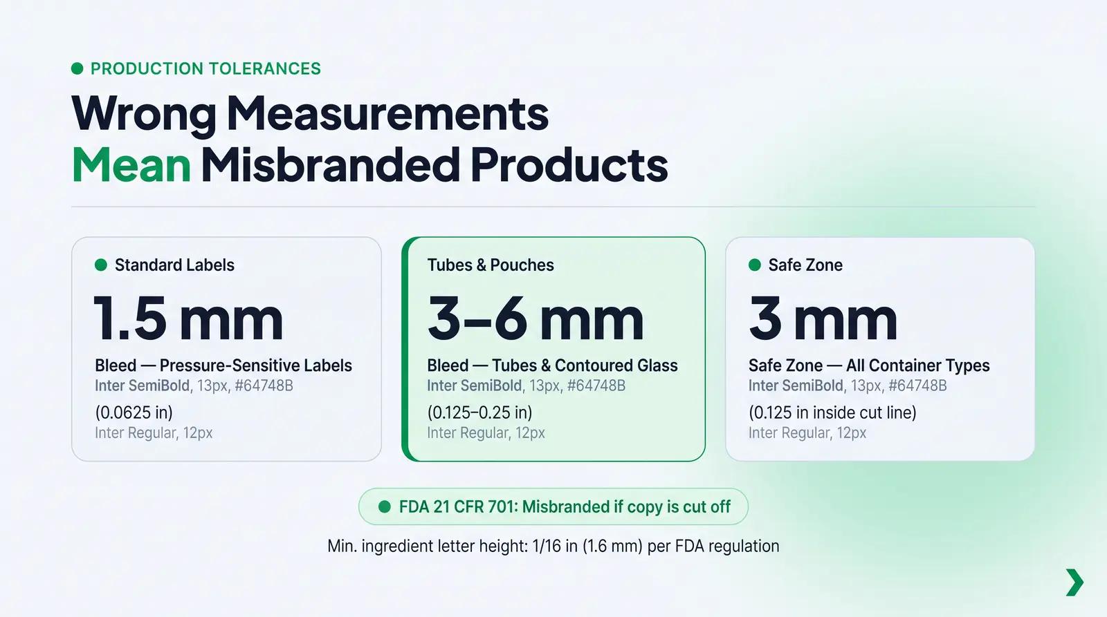
For standard pressure-sensitive cosmetic labels, the industry standard bleed is 0.0625 inches (1.5 mm) past the cut line [8]. However, for primary cosmetic containers like squeeze tubes, flexible pouches, or thick-walled acrylic jars, suppliers frequently specify a larger bleed tolerance of 0.125 inches (3 mm) to 0.25 inches (6 mm) [5] [9]. If your background artwork does not extend fully to these boundaries, any minor mechanical shift during trimming will leave an unsightly white line along the edge of your container.
Safe Zone Distances
The standard safe zone is situated 0.125 inches (3 mm) inside the cut lines [4] [5]. For small cosmetic containers with limited printable real estate, such as a 0.15 oz (4 g) lip balm tube or a 5 ml mini dropper, designers are often tempted to push text closer to the edge. Doing so is highly risky. A shift of just 1 mm during label application can push your text into the trim line or wrap it too close to the container's shoulder, rendering it unreadable.
Connecting Safe Zones to FDA Regulations
The requirement to protect copy inside the safe zone is not merely an aesthetic choice; it is a critical regulatory necessity. The U.S. Food and Drug Administration (FDA), under the authority of the Federal Food, Drug, and Cosmetic Act (FD&C Act) and the Fair Packaging and Labeling Act (FP&L Act), enforces strict labeling regulations codified under 21 CFR Part 701 [10].
These regulations mandate that all required cosmetic label information, such as the ingredient declaration (21 CFR 701.3), the net quantity of contents (21 CFR 701.13), and the name and place of business (21 CFR 701.12), must be displayed with such prominence and conspicuousness that they are readily noticed and understood under customary conditions of purchase [10]. Furthermore, 21 CFR 701.3(b) specifies that ingredient letters must be no less than 1/16 inch (1.6 mm) in height on packages with more than 12 square inches of surface area [10].
If your ingredient list, warning statements, or manufacturer address are placed outside the safe zone and subsequently cut off, clipped, or wrapped into a blind spot on the container, your product is legally deemed misbranded under Section 602 of the FD&C Act [11]. This can result in immediate customs seizures, retail recalls, or severe regulatory penalties under the Modernization of Cosmetics Regulation Act (MoCRA) [12].
Decoration Methods and How They Change Your Dieline
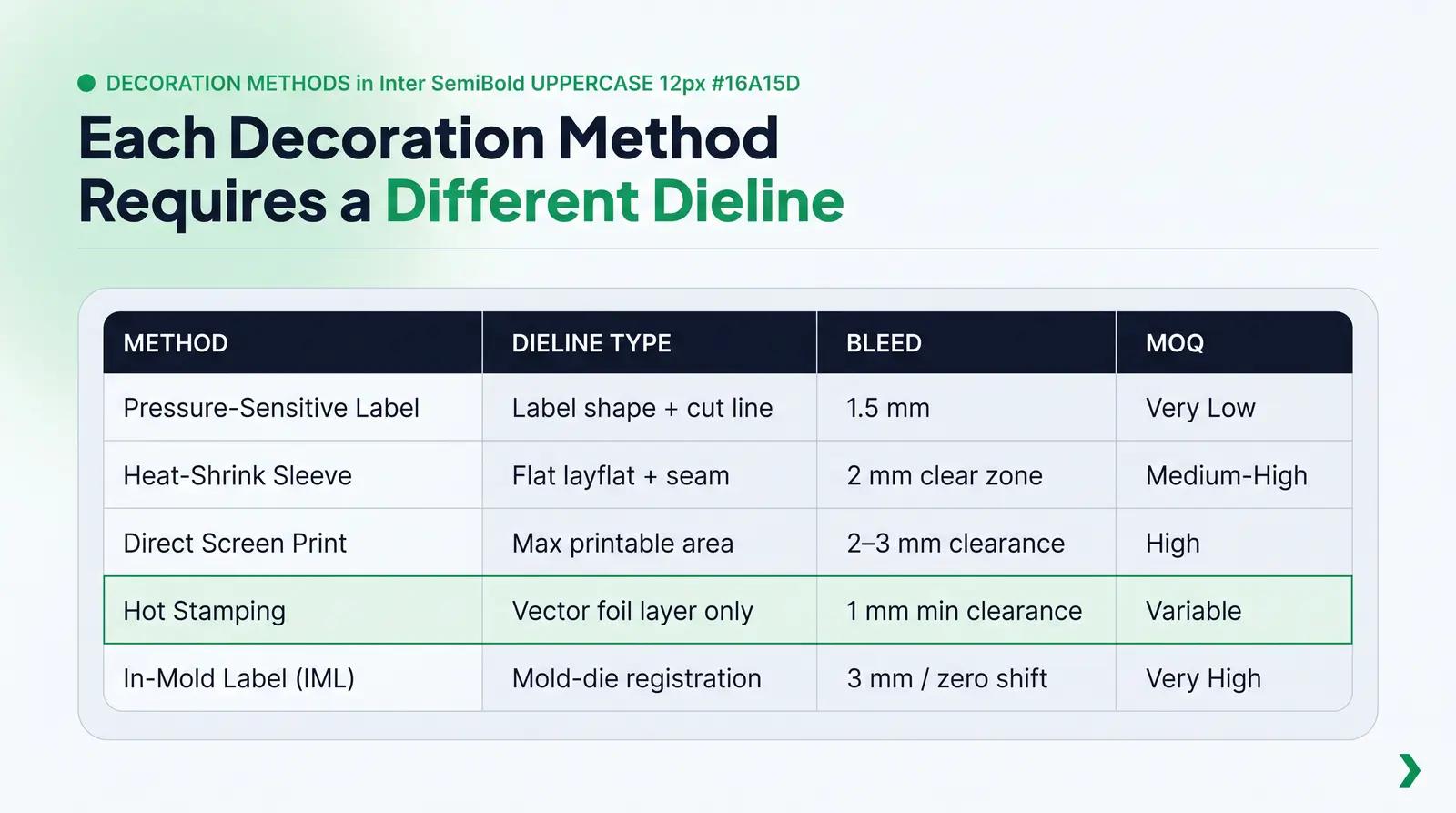
The specific method used to apply artwork to your cosmetic container fundamentally dictates how your dieline is structured, the file formats required, and the physical tolerances you must respect. A dieline designed for a pressure-sensitive label cannot be used for direct screen printing or a heat-shrink sleeve.
Pressure-Sensitive Labels (PSL)
Pressure-sensitive labels are the most common and accessible decoration method for independent beauty brands. These labels consist of a face stock, an adhesive, and a protective release liner [13]. The dieline for a PSL represents the exact shape of the sticker itself. Because PSLs are printed on flat rolls before being applied to the container, they support complex, high-resolution photographic imagery, multi-color CMYK gradients, and decorative embellishments like hot foil stamping and spot UV varnishes.
Heat-Shrink Sleeves
Heat-shrink sleeves are printed on a flexible plastic film (typically PETG or PVC) that is formed into a tube, slipped over the container, and passed through a heat tunnel to shrink tightly to the bottle's contours [6]. The dieline for a shrink sleeve is a flat, continuous template that must account for the "layflat" width, the seaming overlap, and the varying shrink ratios of the container [9]. Artwork in high-shrink zones (such as the neck of a bottle) must be pre-distorted using specialized 3D software so that it appears normal after shrinking [7].
Direct Screen Printing (Silk Screen)
Direct screen printing applies ink directly onto the surface of the container through a fine mesh stencil, which is then cured using ultraviolet (UV) light [14] [15]. There is no physical sticker or film. The dieline for direct screen printing does not represent a cut line; instead, it defines the maximum printable area on the container’s surface. Because the container must rotate on a mandrel during printing, direct screen printing is limited to solid, highly opaque spot colors (Pantone) and cannot easily support fine photographic gradients or complex multi-color overlaps without significant registration issues and high setup costs [14].
Hot Stamping
Hot stamping uses heat and pressure to transfer a metallic or pigmented foil from a carrier film directly onto the container or label surface [15]. It is highly favored in luxury cosmetics for its reflective, premium finish. The dieline for hot stamping requires a dedicated vector layer containing only the solid black vector shapes of the foiled elements, which are used to engrave the physical brass or copper stamping die [16].
In-Mold Labeling (IML)
In-mold labeling is a premium technique where a pre-printed polypropylene label is placed directly inside the injection mold cavity before the plastic resin is injected [17]. The label fuses with the container as it cools, creating a seamless, mono-material finish that is highly durable and 100% recyclable [17]. The dieline for IML must be exceptionally precise, as the label must fit perfectly within the mold steel without slipping or creasing during the high-pressure injection process.
Cosmetic Decoration Methods Compared
To help you evaluate the best approach for your product line, the table below compares five primary decoration methods across key manufacturing dimensions.
| Decoration Method | Typical Application Surface | File Format Required | Bleed & Tolerance | Minimum Order Quantity (MOQ) | Primary Cosmetic Use Case |
|---|---|---|---|---|---|
| Pressure-Sensitive Label (PSL) | Flat, cylindrical, or slightly curved glass and plastic bottles, jars, and droppers. | Vector PDF or AI with layered CMYK and spot finishes [8]. | 0.0625" (1.5 mm) bleed; 0.125" (3 mm) safe zone [5]. | Very Low (100+ units with digital printing) [14]. | Standard skincare serums, face creams, hair oils, and body lotions. |
| Heat-Shrink Sleeve | Complex, highly contoured, or irregular bottle shapes requiring 360-degree coverage. | Layered Vector AI (CS6 preferred); separate layers for white backing and clear zones [9]. | No bleed required; 2 mm clear zones at top and bottom edges [9]. | Medium to High (5,000+ units) [14]. | Squeeze bottles, body washes, hair sprays, and contoured mist bottles. |
| Direct Screen Printing | Cylindrical glass and rigid plastic bottles, jars, and vials [14]. | Vector-only AI or PDF; all elements defined as solid Pantone spot colors [14]. | No bleed; print zone must stay 2 mm to 3 mm clear of shoulders and bases [15]. | High (5,000 to 10,000+ units due to custom screen setup) [14]. | Luxury fragrance bottles, premium facial oils, and high-end glass jars. |
| Hot Stamping | Smooth plastic, glass, and paperboard folding cartons [15]. | Vector-only AI; foiled elements on a separate locked layer named "Foil" [16]. | No bleed; minimum line weight of 0.5 pt; minimum clearance of 1 mm [16]. | Variable (usually tied to the host label or container MOQ) [16]. | Premium brand logos, luxury accents, and metallic regulatory seals. |
| In-Mold Labeling (IML) | Rigid plastic jars, compacts, and thick-walled tubs [17]. | Layered Vector PDF/X-4 with precise mold-die registration lines. | 0.125" (3 mm) bleed; absolute zero tolerance for label shifting. | Very High (10,000 to 50,000+ units due to mold integration) [17]. | Makeup compacts, luxury cream tubs, and professional salon tubs. |
A Practical Framework for Preparing Your Dieline File
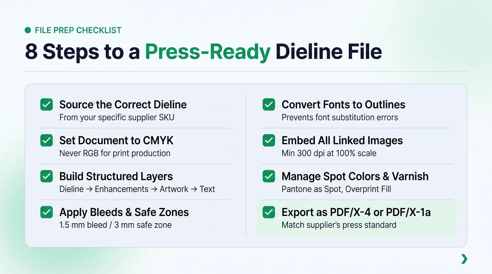
To ensure your packaging artwork transitions seamlessly from your computer screen to the production floor without expensive errors, we recommend following The Dieline-Ready File Checklist. This step-by-step framework represents the professional prepress standard required by high-quality packaging platforms.
The Dieline-Ready File Checklist
-
1. Source the Correct Production Dieline
- Never design on a generic, downloaded template or attempt to measure and draw a dieline from scratch.
- Always request the official, production-ready dieline directly from your specific packaging supplier or platform for the exact SKU and production run.
-
2. Verify Document Setup in Your Vector Editor
- Use Adobe Illustrator or Affinity Designer. Never use raster-based software like Adobe Photoshop for layout, text, or dieline construction [9].
- Set your Document Color Mode strictly to CMYK (never RGB) to ensure predictable color reproduction on physical presses [8].
- Confirm that your document scale is set to 100% of actual size with units defined in inches or millimeters [9].
-
3. Establish a Structured Layer Hierarchy
- Keep your document organized into separate, clearly labeled layers.
- Layer 1: Dieline (Locked) – Contains the supplier's technical template (cut, fold, and bleed lines) set to a highly visible spot color (e.g., 100% Magenta) and set to "Overprint" [8].
- Layer 2: Enhancements (Locked/Optional) – Contains spot UV, embossing, or hot foil stamping vector paths defined as solid spot colors [8].
- Layer 3: Artwork – Contains all your background colors, graphics, patterns, and imagery.
- Layer 4: Text & Logos – Contains all vector brand elements and mandatory regulatory copy.
-
4. Account for Bleeds and Safe Zones
- Extend all background artwork, solid colors, and patterns at least 0.0625 inches (1.5 mm) past the cut lines for labels, and 0.125 inches (3 mm) for cartons [5] [8].
- Verify that all critical text, ingredient lists, and brand marks reside at least 0.125 inches (3 mm) inside the cut lines [5].
-
5. Convert All Fonts to Outlines
- Select all text elements and apply Type > Create Outlines (or
Ctrl+Shift+O/Cmd+Shift+O) [8]. - This converts your editable text into permanent vector paths, preventing font substitution errors, character drops, or reflow issues at the print facility when they open your file [8].
- Select all text elements and apply Type > Create Outlines (or
-
6. Embed All Linked Images
- Open your Links panel, select all linked raster images (such as photographs or painted backgrounds), and click Embed Images [8].
- This packages the image data directly inside your vector document, preventing "missing link" errors during file transfer [8].
- Ensure all embedded raster images have a physical resolution of at least 300 dpi at 100% scale [8] [9].
-
7. Manage Spot Colors and Varnish Layers
- If using Pantone colors, verify they are designated as "Spot" in your swatches panel and match your supplier's color specifications [9].
- If applying spot UV or foil, ensure those paths are 100% vector, colored in a dedicated spot swatch named "Spot_UV" or "Foil", and set to "Overprint Fill" to prevent knocking out the CMYK artwork underneath.
-
8. Export to Press-Ready PDF Standards
- Export your final file as a high-resolution, layered PDF.
- Use the PDF/X-4 standard if your design contains transparent elements or complex layering, as it supports live transparency and color profiles [18].
- Use the PDF/X-1a standard if your supplier operates older press software that requires flattened transparencies and strict CMYK/Spot color enforcement [18].
- Ensure "Document Bleed Settings" are checked in the export menu to include your bleed data.
Worked Example: Preparing a Label File for a 1 oz (30 ml) Serum Dropper Bottle
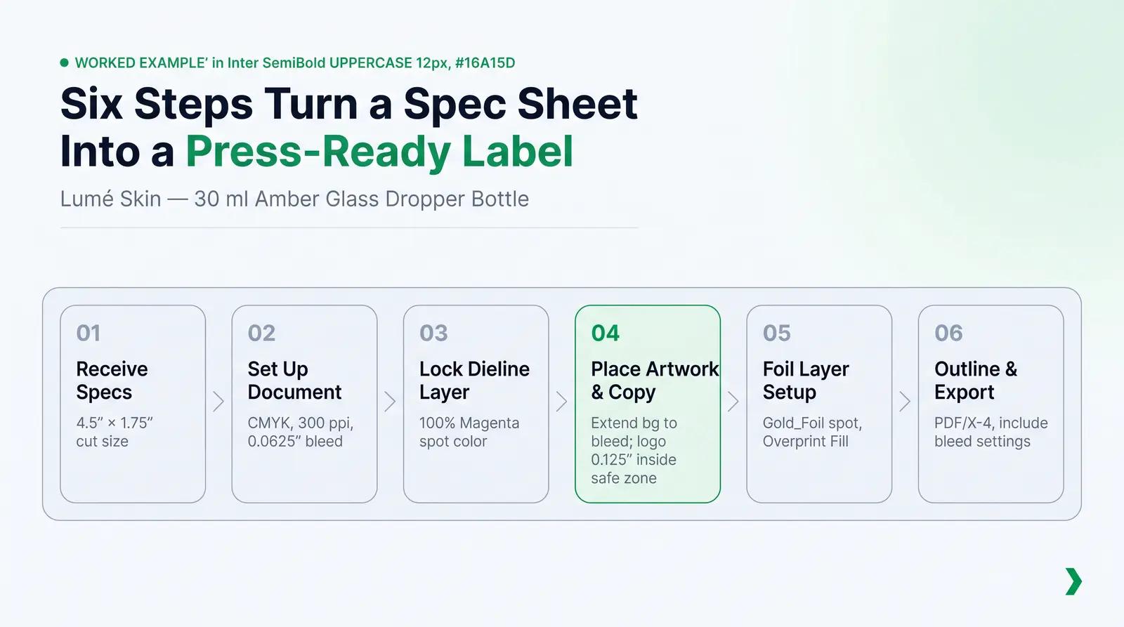
To illustrate this framework in action, let us walk through a realistic prepress scenario featuring a fictional independent skincare brand, Lumé Skin.
Lumé Skin is preparing a pressure-sensitive, wrap-around paper label for their new hydrating serum, packaged in a standard 30 ml (1 oz) amber glass dropper bottle sourced from Packfolio's curated catalog.
+-----------------------------------------------------------------------------+
| ~ ~ ~ ~ ~ ~ ~ ~ ~ ~ ~ ~ ~ ~ ~ ~ BLEED AREA ~ ~ ~ ~ ~ ~ ~ ~ ~ ~ ~ ~ ~ ~ ~ ~ ~|
|  +-----------------------------------------------------------------------+  |
|  | ----------------- CUT LINE (Label Size: 4.5" x 1.75") --------------  |  |
|  |  +-----------------------------------------------------------------+  |  |
|  |  | ............. SAFE ZONE (Keep copy 0.125" inside) ............. |  |  |
|  |  |                                                                 |  |  |
|  |  |  [INGREDIENTS]          [LUMÉ SKIN]            [DIRECTIONS]     |  |  |
|  |  |  Aqua, Glycerin,        HYDRATING SERUM        Apply 3-4 drops  |  |  |
|  |  |  Hyaluronic Acid,       Niacinamide + B5       to clean skin.   |  |  |
|  |  |  Niacinamide,           ----------------       --------------   |  |  |
|  |  |  Phenoxyethanol.        1 fl. oz. (30 ml)      Lume Skin LLC    |  |  |
|  |  | ............................................................... |  |  |
|  |  +-----------------------------------------------------------------+  |  |
|  |                                                                       |  |
|  +-----------------------------------------------------------------------+  |
| ~ ~ ~ ~ ~ ~ ~ ~ ~ ~ ~ ~ ~ ~ ~ ~ BLEED AREA ~ ~ ~ ~ ~ ~ ~ ~ ~ ~ ~ ~ ~ ~ ~ ~ ~|
+-----------------------------------------------------------------------------+
Step 1: Receiving the Dimensions
Lumé Skin requests the technical dieline for the 30 ml SKU. The supplier provides a dieline with the following specifications:
- Physical Label Dimensions (Cut Size): 4.5 inches (114.3 mm) width × 1.75 inches (44.45 mm) height.
- Bleed Requirement: 0.0625 inches (1.5875 mm) on all four sides.
- Safe Zone (Live Area): 0.125 inches (3.175 mm) inside the cut line.
Step 2: Document Setup in Adobe Illustrator
The designer opens Adobe Illustrator and creates a new document with these parameters:
- Width: 4.5 inches
- Height: 1.75 inches
- Bleed: Top, Bottom, Left, and Right set to 0.0625 inches (making the total canvas size including bleed 4.625 inches × 1.875 inches).
- Color Mode: CMYK Color
- Raster Effects: High (300 ppi)
Step 3: Positioning the Dieline Template
The designer imports the supplier's vector dieline PDF. They place the dieline on a dedicated layer named Dieline, center it perfectly on the artboard, lock the layer, and set the dieline's stroke to a custom spot color named "Dieline_Cut" (defined as 100% Magenta) so it stands out clearly against the artwork.
Step 4: Placing the Artwork and Copy
The Lumé Skin brand identity features a solid pastel sage green background with a gold foil logo.
- The Background: The designer draws a rectangle filled with the sage green color. Instead of snapping it to the 4.5" × 1.75" cut line, they extend it fully to the outer red bleed boundary (4.625" × 1.875"). This ensures that if the cutting blade shifts slightly during trimming, no raw white paper edges will be exposed.
- The Safe Zone Audit: The designer sets up guides 0.125 inches inside the artboard edges to mark the safe zone.
- The Critical Decision Point: During the initial layout, the designer notices that the brand's elegant gold foil wordmark is positioned exactly 0.05 inches (1.27 mm) from the top cut line. Recognizing that this is far outside the safe zone minimum of 0.125 inches (3.175 mm), they immediately shift the logo downward by 0.1 inches (2.54 mm). This relocation protects the luxury wordmark from being sliced in half during high-speed mechanical trimming.
- Regulatory Copy: The mandatory drug-facts style ingredient declaration, the net content statement ("1 fl. oz. (30 ml)"), and the distributor address are placed on the side panels, keeping them safely inside the 0.125-inch safe zone guides to ensure absolute compliance with FDA 21 CFR Part 701 [10].
Step 5: Preparing the Gold Foil Layer
Because the Lumé Skin logo requires gold foil stamping, the designer duplicates the logo vector path, cuts it from the artwork layer, and pastes it onto a new layer named Foil_Gold. They fill the path with a solid spot color named "Gold_Foil" and set the stroke and fill to "Overprint" to prevent the printing plates from knocking out the sage green background ink underneath.
Step 6: Outlining and Exporting
- The designer selects all text elements and hits
Cmd+Shift+Oto convert the typography into outlined vector shapes. - They open the Links panel and verify that there are no linked raster images, as the design is entirely vector-based.
- Finally, they go to File > Save As, select Adobe PDF, and choose the PDF/X-4:2010 preset. In the "Marks and Bleeds" section, they check "Use Document Bleed Settings" to ensure the 0.0625-inch bleed is included in the export. The resulting press-ready PDF is delivered to the production team.
Common Dieline Mistakes That Delay Production
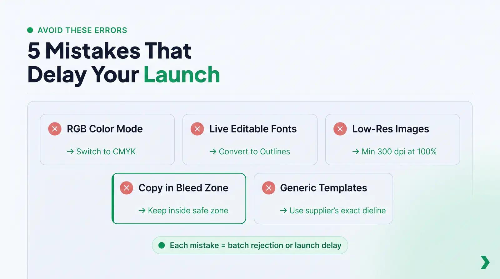
Even experienced graphic designers can make technical errors when translating a digital design onto a physical packaging dieline. Avoiding these five common mistakes will save your brand thousands of dollars in wasted materials and weeks of launch delays.
1. Designing in RGB Color Mode
Computer screens display color using the RGB (Red, Green, Blue) light spectrum, whereas industrial printing presses utilize the CMYK (Cyan, Magenta, Yellow, Key/Black) ink spectrum or physical Pantone spot inks [8]. If you design your packaging files in RGB, your vibrant screen colors will undergo dramatic, unpredictable shifting when converted to ink, often resulting in muddy, desaturated tones on your physical bottles.
2. Failing to Outline Fonts
If you leave your typography as editable text, the printer's computer must have the exact same font files installed on their system [8]. If they do not, their software will automatically substitute your custom brand typography with a default font (such as Myriad Pro or Arial). This can ruin your branding, cause text to overflow its boundaries, and immediately halt production. Always convert your text to outlines before exporting [8].
3. Using Low-Resolution Raster Images
While vector graphics (AI, EPS) can be scaled infinitely without losing clarity, raster images (PNG, JPEG) are made of a fixed grid of pixels [8]. If you include product photography or painted background graphics that are below 300 dpi (dots per inch) at actual print size, your finished labels will appear highly pixelated, blurry, and unprofessional [8] [9].
4. Placing Critical Copy in the Bleed or Trim Zones
Founders often attempt to maximize their printable area by pushing ingredient lists, warning text, or barcode elements right up to the edge of the label. If this copy enters the safe zone boundary or bleeds over the cut line, there is a high probability that it will be partially or completely sliced off during trimming, leading to an immediate batch rejection and regulatory non-compliance [11].
5. Ignoring Supplier-Specific Tolerances
Every manufacturing facility operates different machinery with unique physical tolerances. Assuming that a dieline template from one supplier will fit a "similar" bottle from another supplier is a recipe for disaster. Always design on the exact dieline provided by the partner executing your production run.
The Non-Obvious Reality of Supplier Dielines
Most conventional packaging guides offer seemingly straightforward advice: "Simply ask your supplier for the dieline, drop in your artwork, and send it back." While this sounds simple, it ignores a highly problematic reality of global cosmetic manufacturing: slight physical variations between production runs can render catalog dielines completely inaccurate.
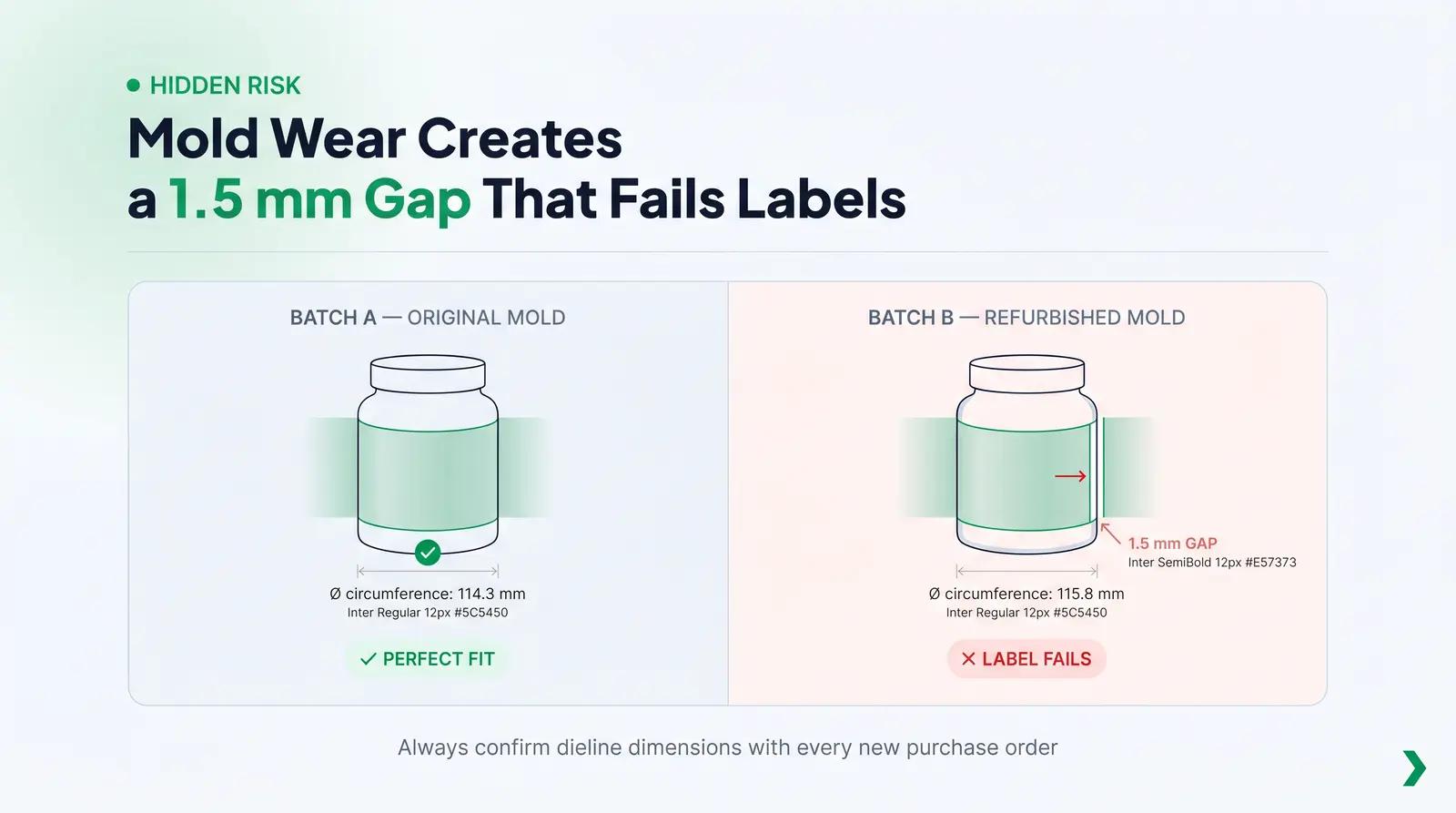
Primary cosmetic containers, particularly glass bottles and injection-molded plastic components, are manufactured using physical molds that wear down over time. When a factory refurbishes or replaces a mold, the physical dimensions of the container can shift by 1 mm to 3 mm. While a 1 mm deviation seems negligible, it completely changes the circumference of a bottle.
BATCH A BOTTLE (Original Mold)              BATCH B BOTTLE (Refurbished Mold)
+-------------------------------+           +---------------------------------+
|                               |           |                                 |
|  Circumference: 114.3 mm      |           |  Circumference: 115.8 mm        |
|  Label: 114.3 mm (Perfect)    |           |  Label: 114.3 mm (1.5 mm GAP!)  |
|                               |           |                                 |
+-------------------------------+           +---------------------------------+
If you use a generic catalog dieline designed for a bottle’s original mold on a batch produced from a refurbished mold, your wrap-around label will fail to meet, leaving an unsightly 1.5 mm gap of exposed glass, or your direct screen printing will fail to align correctly at the seam.
To protect your brand from this hidden risk, you must adopt professional quality control standards:
- Request Dieline Confirmation with Every Purchase Order: Never assume a dieline from a previous production run is valid for a new PO. Force your supplier to physically measure the current batch and confirm the dieline dimensions in writing.
- Utilize Pre-Modeled 3D SKU Environments: The modern, risk-free alternative is to source your packaging through an integrated platform like Packfolio.
Packfolio curates a highly vetted catalog of cosmetic primary packaging SKUs where every bottle, jar, and tube is pre-modeled in 3D with predefined, locked printable regions [19]. Because the dieline is mathematically tied directly to the specific physical SKU in the factory, the dieline is, in effect, already embedded in the browser-based 3D design tool [19].
This completely eliminates the risk of using an outdated or generic template, allowing beauty founders to design with absolute confidence that what they preview in photorealistic 3D is exactly what will land on their doorstep from the production line.
The Path to Print-Ready Success
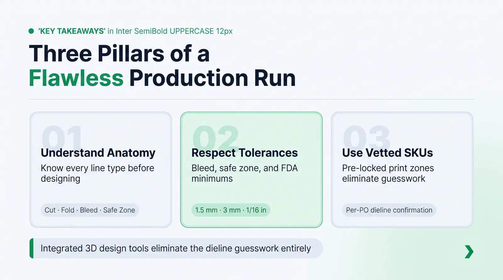
Navigating the technical landscape of packaging dielines can feel overwhelming for beauty founders focused on formulation and brand building. However, by understanding the anatomy of your dieline, respecting manufacturing tolerances, and following a structured file preparation checklist, you can eliminate prepress errors and ensure a flawless production run.
Sourcing your containers through a platform that integrates structural engineering with digital design is the most reliable way to bypass these traditional supply chain headaches. By utilizing pre-vetted SKUs with locked print zones, you bridge the gap between creative design and physical reality from day one.
Browse Packfolio's curated cosmetic packaging catalog—every SKU comes with predefined print zones already mapped in the 3D design tool, so you're always working from the right dieline. Explore the catalog and preview your label in 3D →
Frequently Asked Questions
What is the difference between a dieline and a packaging template?
A packaging template is a general visual mockup used by designers to lay out graphics and visualize the overall aesthetic of a package. A dieline is a highly precise, production-ready vector file that contains mathematically defined cut, fold, and bleed lines used directly by manufacturing machinery to print, cut, and assemble the physical packaging [2].
Can I create a cosmetic packaging dieline in Canva or Photoshop?
No. Canva and Photoshop are raster-based or simplified design tools that cannot generate the precise, mathematically described vector paths required by industrial die-cutting and printing machinery [9]. Dielines must be constructed as vector art in professional CAD software or vector editors like Adobe Illustrator or Affinity Designer [2] [9].
How much bleed do I need to include on a cosmetic bottle label?
The standard bleed for pressure-sensitive cosmetic labels is 0.0625 inches (1.5 mm) past the cut line [8]. However, for primary containers like squeeze tubes or highly contoured glass bottles, suppliers may require a bleed of 0.125 inches (3 mm) to 0.25 inches (6 mm) to account for larger mechanical tolerances during production [5] [9].
Why does my wrap-around label have a gap or overlap when applied to the bottle?
This occurs when the dieline fails to account for the exact circumference of the bottle plus a necessary overlap tolerance (typically 3 mm to 6 mm), or when slight mold variations between factory production runs change the physical diameter of the bottle. To prevent this, always confirm dieline dimensions with each specific purchase order or use a platform with locked, pre-vetted 3D SKUs [19].
What happens if my cosmetic ingredient list is placed outside the safe zone?
If critical regulatory copy like the ingredient list is placed outside the safe zone, it risks being partially sliced off during trimming or wrapped into a physical blind spot on the container. Under FDA 21 CFR Part 701, this renders your product legally misbranded, which can result in customs seizures, retail recalls, and severe regulatory penalties [10] [11].
References
- [1] Pakfactory, What is a Dieline in Packaging & Print?, Pakfactory Blog, 2025, https://pakfactory.com/blog/learn/what-is-a-dieline/
- [2] GlobalVision, What Is a Dieline in Printing and Packaging?, GlobalVision Blog, 2025, https://www.globalvision.co/blog/what-is-a-dieline-in-printing-and-packaging
- [3] K. Sheriff, From Design to Proof: A Guide to Packaging Die Lines, Admiral Packaging, 2025, https://admiralpkg.com/post/dielines
- [4] Sttark, How to Label a Tapered Container or Curved Surface, Sttark Blog, 2021, https://www.sttark.com/blog/how-to-label-a-tapered-container-or-curved-surface
- [5] P. Seesholtz, How to Taper a Label for Your Products, Blue Label Packaging Company, 2024, https://www.bluelabelpackaging.com/blog/how-to-taper-a-label-for-your-products/
- [6] Eastgate Group, Choosing the Right Label: Comparing Shrink Sleeve, Screen Print, and PS Labeling, Eastgate Group, 2025, https://eastgategroup.com/choosing-the-right-label/
- [7] Resource Label Group, Shrink sleeve label design: considerations for reducing shrink distortion, Resource Label Group, 2018, https://www.resourcelabel.com/blog/2018/08/13/shrink-sleeve-label-design-considerations-for-reducing-shrink-distortion/
- [8] PackMojo, Dieline Design Tips, PackMojo, 2025, https://packmojo.com/dieline-design-tips/
- [9] Traco Packaging, Shrink Sleeve Design Guidelines, Traco Packaging, 2019, https://tracopackaging.com/2019/01/01/shrink-sleeve-design-guidelines/
- [10] U.S. Food and Drug Administration, Code of Federal Regulations Sections for Cosmetics Labeling (CFR Title 21, Part 701), FDA, 2022, https://www.fda.gov/cosmetics/cosmetics-labeling-regulations/code-federal-regulations-sections-cosmetics-labeling-cfr-title-21-part-701
- [11] U.S. Food and Drug Administration, Summary of Cosmetics Labeling Requirements, FDA, 2025, https://www.fda.gov/cosmetics/cosmetics-labeling-regulations/summary-cosmetics-labeling-requirements
- [12] U.S. Food and Drug Administration, Modernization of Cosmetics Regulation Act of 2022 (MoCRA), FDA, 2026, https://www.fda.gov/cosmetics/cosmetics-laws-regulations/modernization-cosmetics-regulation-act-2022-mocra
- [13] Pro-Motion Industries, Labeling vs. screen printing: Which one is right for your cosmetic product?, Pro-Motion Industries Blog, 2021, https://www.pro-motion.ws/blog/labeling-vs-screen-printing/
- [14] Uzone Packaging, 7 Printing Methods for Cosmetic Packaging, Uzone Packaging, 2025, https://www.uzonepackaging.com/7-printing-methods-for-cosmetic-packaging.html
- [15] Shnayi, What Are the Quality Requirements for Cosmetic Glass Bottles?, Shnayi News, 2025, https://www.shnayi.com/news/what-are-the-quality-requirements-for-cosmetic-glass-bottles/
- [16] United Silicone, Quality Hot Stamp Artwork & Graphic Design specifications, United Silicone Blog, 2023, https://unitedsilicone.com/blog/quality-hot-stamp-artwork-graphic-design-hot-stamp-die-specifications/
- [17] Canopy Beauty, In-Mold Labeling (IML) vs. Pressure Sensitive (PS) Labels, Canopy Beauty Blog, 2025, https://canopybeauty.com/in-mold-labeling-iml-vs-pressure-sensitive-ps-labels/
- [18] Premier Press, Print-Ready PDF/X-1A AND PDF/X-4 Files, Premier Press Blog, 2013, https://www.premierpress.com/blog/print-ready-pdfx-1a-and-pdfx-4a-files/
- [19] Packfolio, Beauty Packaging Without the Supply Chain, Packfolio, 2026, https://packfolio.com/


