
How to Design a Cosmetic Label That Works on Real Packaging
Design cosmetic labels that fit real containers by mastering curvature mapping, regulatory font sizes, bleed tolerances, material selection, and the S.U.R.V.I.V.E. framework.
Every designer knows the thrill of a flawless flat layout on a high-resolution monitor. The colors pop, the typography looks crisp, and the minimalist grid feels incredibly modern.
But that beautiful digital mockup faces a brutal reality when it meets a physical container. In the real world, labels must survive tight curvatures, high-humidity bathrooms, shipping friction, and strict regulatory inspectors [1].
Designing for physical packaging is not just an aesthetic challenge, it is a structural engineering task. Understanding the physical and mechanical constraints of your packaging is what separates a failed print run from a successful product launch [2].
The Physics of the Container: Shape, Curvature, and Label Adhesion
A label that sticks perfectly to a flat cardboard box will fail on a round glass bottle. This failure is driven by the physical forces of surface tension and material memory.
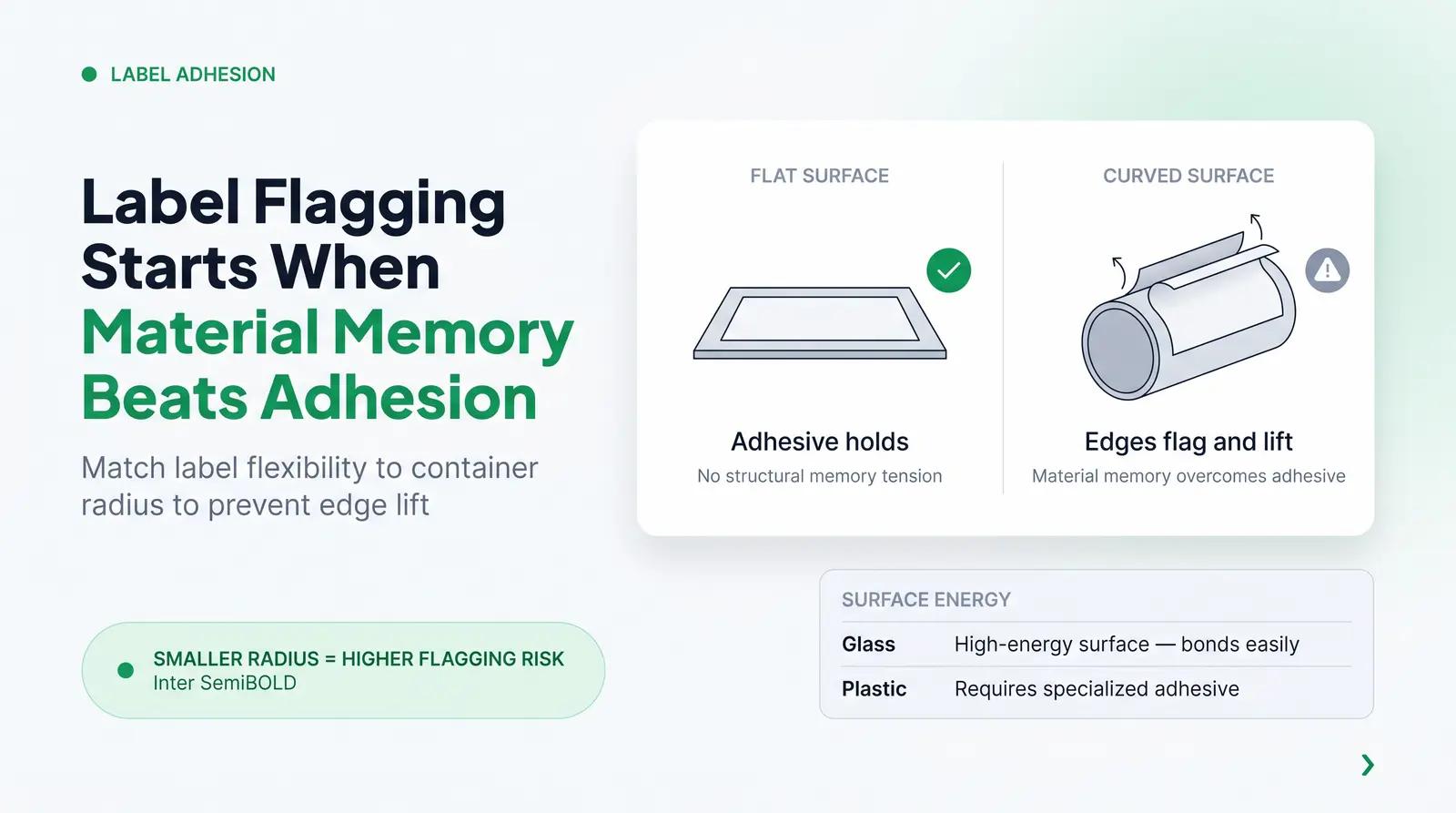
When a flat label material is wrapped around a curved surface, it naturally wants to return to its flat state. This physical resistance is known in the packaging industry as label flagging [3].
Flagging occurs when the adhesive cannot overcome the structural memory of the label material. The edges of the label lift, bubble, and peel away from the container over time.
To prevent flagging, you must match your label material's flexibility to the container's radius. Smaller containers, like lip balm tubes or 15ml vials, have a tighter radius and require highly flexible films.
Glass and plastic also interact differently with adhesives. Glass is a high-energy surface that bonds easily, while certain plastics require specialized adhesives to stay secure [3].
Real-World Dimensions and Printable Real Estate: A Worked Example
To design a label that fits, you must measure the straight, flat wall of the container. Never guess the printable area, and never design to fit later [2].
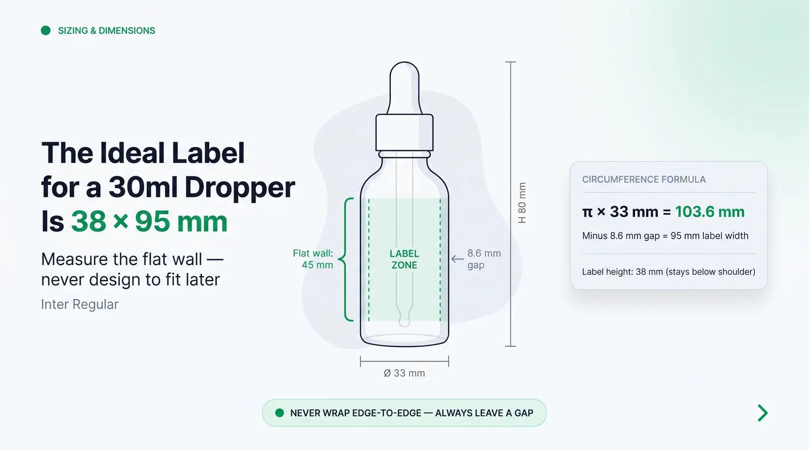
Let us look at a worked example of a standard 30ml serum dropper bottle. A typical 30ml glass dropper bottle has a total height of 80mm and a diameter of 33mm [4].
The straight cylindrical wall of this bottle is only 45mm high before the shoulder curves upward. If your label is taller than 45mm, the top edge will wrinkle and lift because it cannot conform to the shoulder's curve [5].
To calculate the maximum wrap-around width, we use the basic formula for circumference: $$\text{Circumference} = \pi \times \text{Diameter}$$
For our 33mm diameter bottle, the total circumference is approximately 103.6mm. However, a full wrap-around label where the ends touch or overlap is highly prone to flagging [5].
Instead, you must leave a gap of 3mm to 6mm between the label ends. This gap accommodates machine application tolerances and ensures the label adheres firmly to the glass [5].
Therefore, the ideal label size for this 30ml dropper bottle is 1.5 inches high by 3.75 inches wide (38mm by 95mm) [4]. This leaves a safe 8.6mm gap at the back, preventing edge-overlap lifting entirely.
Design Hierarchy and Regulatory Compliance Text
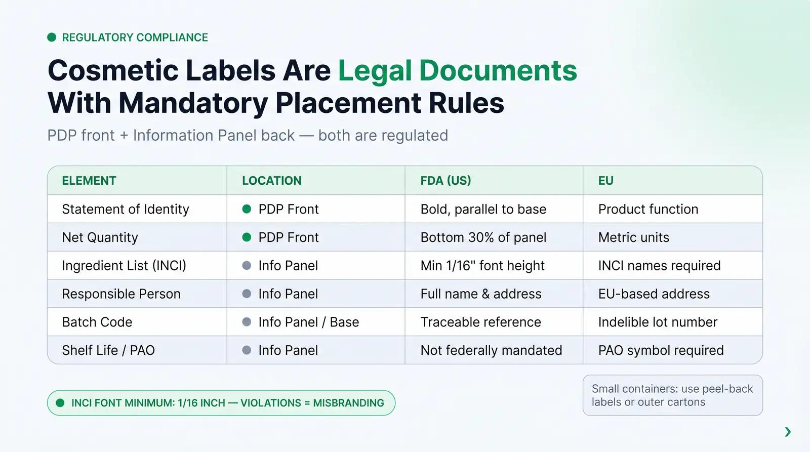
Cosmetic labels are heavily regulated legal documents, not just branding canvases. The law dictates what must be on your label, where it must go, and how large the font must be [1].
In the United States, the Food and Drug Administration (FDA) governs cosmetic labeling under the Fair Packaging and Labeling Act and the Modernization of Cosmetics Regulation Act (MoCRA) [1] [6]. In Europe, the governing framework is Regulation (EC) No. 1223/2009 [7].
Your label must be divided into two primary areas: the Principal Display Panel (PDP) and the Information Panel [6]. The PDP is the front of your label, while the Information Panel is typically the back or side.
The table below outlines the mandatory elements required for compliance across major markets:
| Label Element | Required Location | FDA (US) Requirement [1] [6] | EU Requirement [7] |
|---|---|---|---|
| Statement of Identity | PDP (Front) | Bold, parallel to base, descriptive name | Product function, translated locally |
| Net Quantity | PDP (Front) | Bottom 30% of panel, US units (metric optional) | Weight or volume in metric units |
| Responsible Person | Information Panel | Name, full address, and zip code | EU-based Responsible Person address |
| Country of Origin | Information Panel | Mandatory for imported goods | Mandatory for non-EU produced goods |
| Ingredient List (INCI) | Information Panel | Descending order of weight, minimum 1/16" font | INCI names, local language warnings |
| Batch Code | Information Panel or Base | Traceable production reference | Indelible lot or batch number |
| Shelf Life / PAO | Information Panel | Not federally mandated (except for drugs) | PAO symbol (open jar) for >30 months |
"The letters of the ingredient declaration must not be less than 1/16 of an inch in height. If the total package surface available is less than 12 square inches, the letters must not be less than 1/32 of an inch." [1]
For small containers like dropper bottles, fitting a 50-ingredient INCI list at 1/16-inch font is incredibly difficult. Over-designing small labels with complex graphics leaves no room for this legally mandated text [8].
When space is extremely tight, brands must use multi-panel peel-back labels or outer cartons [5] [7]. Ignoring these font size minimums will result in your product being classified as misbranded, leading to costly recalls [6].
Production Tolerances and Printing Realities
Mechanical printing is a physical process with built-in variances. Your artwork must be designed to absorb these mechanical movements, or it will look misaligned on the shelf.
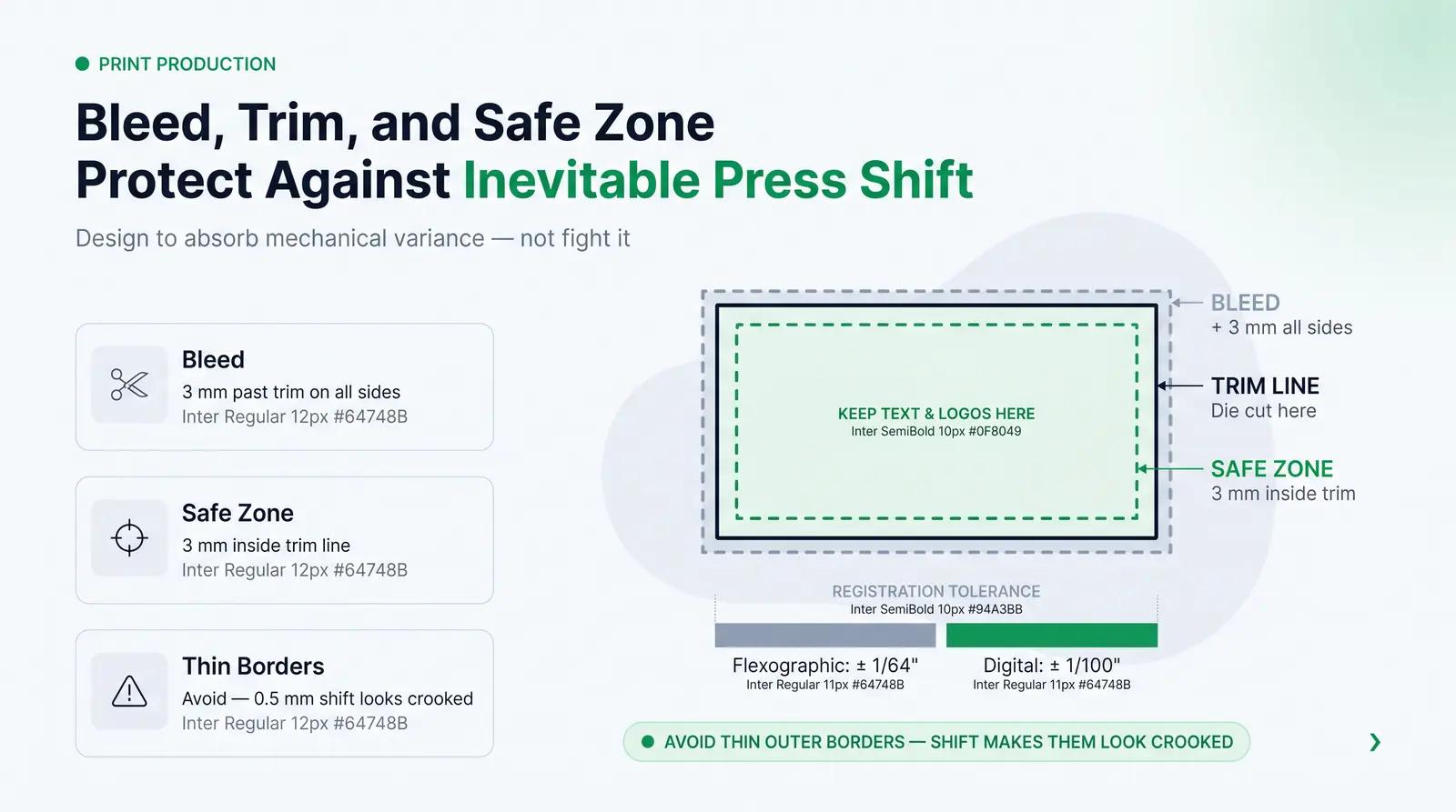
The most critical printing concept to master is the relationship between the bleed, the trim line, and the safe zone [2]. The trim line is where the blade or die cuts the label, while the bleed is the artwork that extends past this line.
You must apply a minimum 3mm (0.125 inches) bleed on all sides of your artwork [2]. This ensures that if the cutting die shifts slightly, no accidental white edges appear on your finished label.
Similarly, all critical text and logos must stay within the safe zone, which is 3mm inside the trim line [2]. This keeps your brand elements safe from being cut off during production.
Every printing press experience registration shift, which is the slight misalignment of ink plates or cutting dies [9]. Flexographic printing has a registration tolerance of up to 1/64 of an inch, while digital printing is tighter at 1/100 of an inch [9].
Because of this inevitable mechanical shift, you should avoid thin borders along the very edge of your label. Even a microscopic shift of 0.5mm will make a thin outer border look visibly crooked and off-center [9].
Decoration Methods and Material Performance
Choosing the right decoration method and material is just as important as the artwork itself. Your label must withstand water, cosmetic oils, and constant handling without smudging or peeling [3].
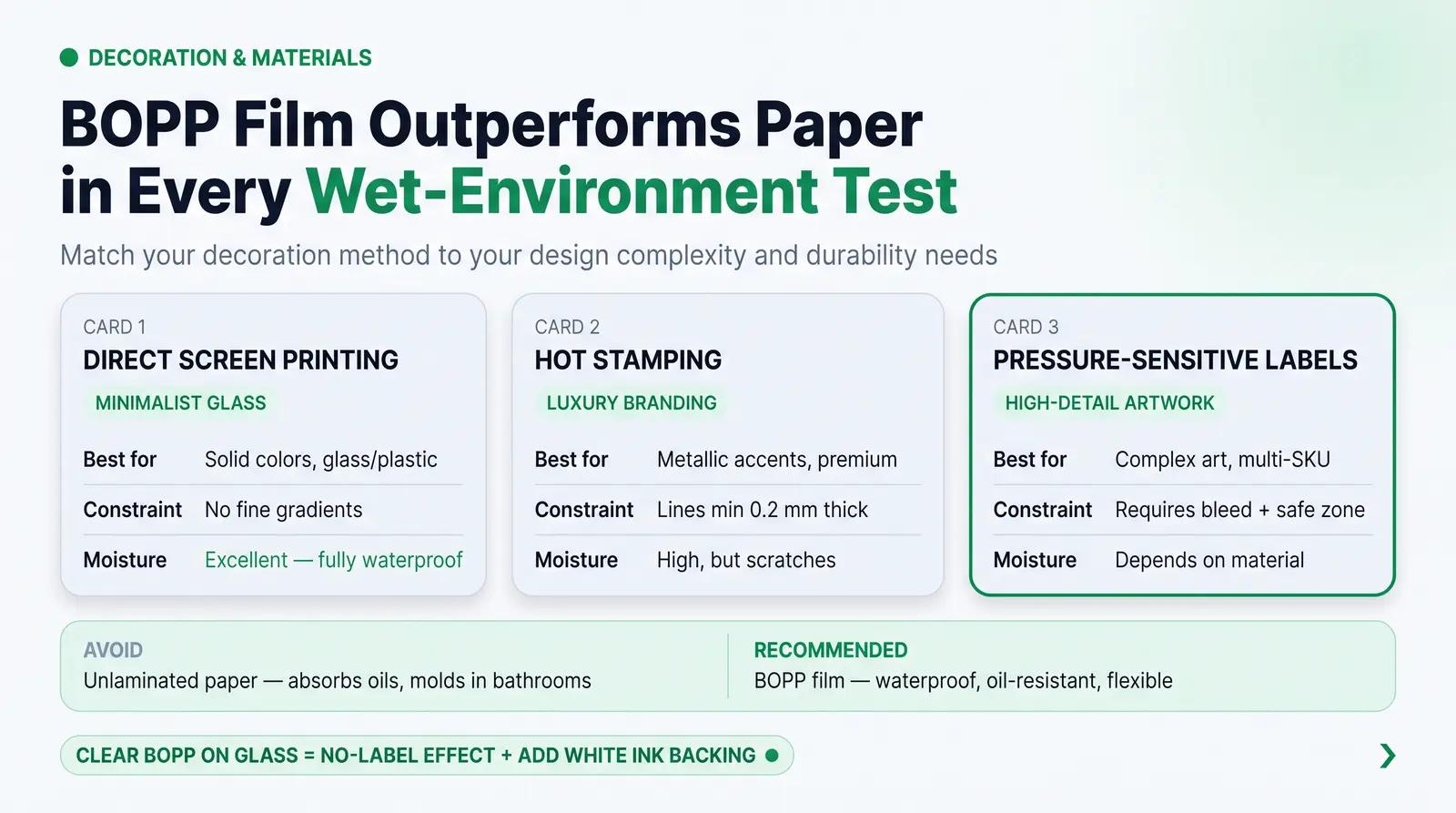
The three primary decoration methods for cosmetic packaging each have unique design constraints:
| Decoration Method | Best Suited For | Key Design Constraint | Moisture & Oil Resistance |
|---|---|---|---|
| Direct Screen Printing | Minimalist glass or plastic bottles | No fine gradients, solid colors only | Excellent, completely waterproof |
| Hot Stamping | Metallic accents, luxury branding | Avoid ultra-thin lines under 0.2mm | High, but susceptible to scratching |
| Pressure-Sensitive Labels | High-detail artwork, multi-SKU runs | Requires bleed and safe zone planning | Variable, depends entirely on material |
For custom adhesive labels, paper should be avoided unless it is laminated with a protective film [3]. Unprotected paper labels absorb oils and moisture, leading to mold, smudging, and tearing in wet bathroom environments.
Instead, beauty brands should utilize plastic films like BOPP (Biaxially Oriented Polypropylene) [3] [4]. BOPP is waterproof, oil-resistant, and highly flexible, making it the industry standard for skincare products.
If you want a seamless, premium look, clear BOPP labels create a no-label effect on glass bottles [4]. However, clear labels require a solid white ink backing printed beneath your colored text to keep the design readable against the product liquid.
The 3D Design to Production Pipeline
To avoid these physical production traps, smart beauty brands are changing how they design. Instead of designing flat artwork in isolation, they utilize integrated 3D design environments.
This is where custom packaging platforms like packfolio.com have revolutionized the industry. Packfolio curates a vetted catalog of cosmetic primary packaging SKUs, which can be viewed directly in their catalog.
Every SKU is pre-modeled in 3D with predefined, flat printable regions. By using their browser-based 3D design tool, designers can place artwork directly within these safe print zones.
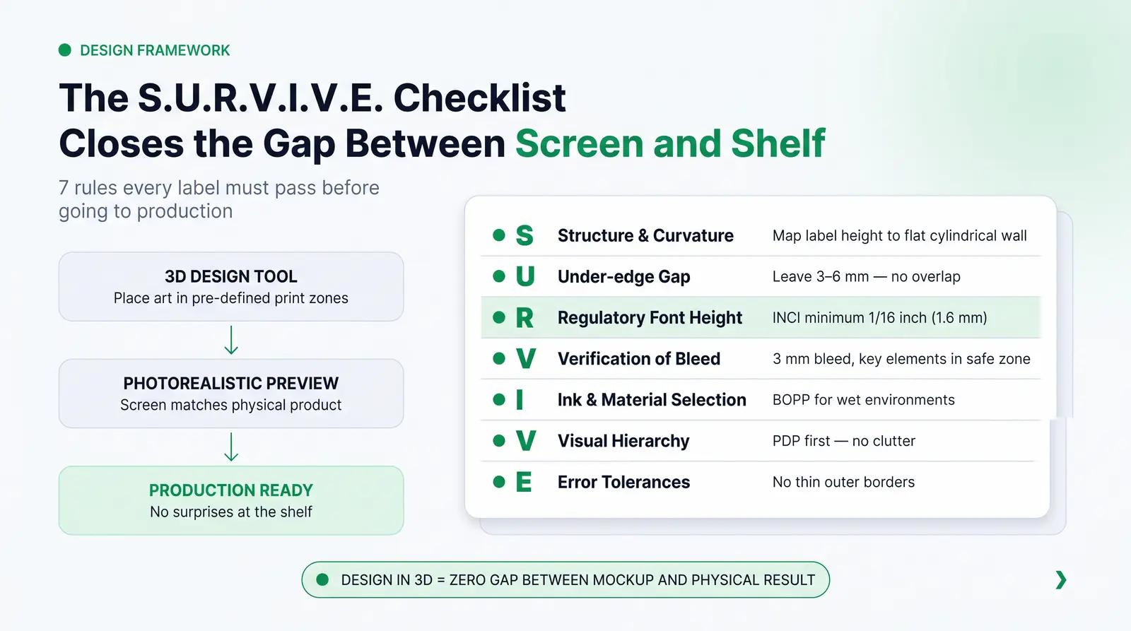
This setup ensures that your design never crosses a curved shoulder, overlaps an edge, or violates a mechanical constraint. The photorealistic 3D preview matches the final physical product, eliminating the gap between screen and shelf.
To ensure your next packaging project is successful, follow this structured checklist:
The S.U.R.V.I.V.E. Label Design Framework
- S - Structure & Curvature: Map your label height strictly to the flat, cylindrical wall of the container.
- U - Under-edge Gap: Leave a 3mm to 6mm gap on wrap-around labels to prevent overlap flagging.
- R - Regulatory Font Height: Keep INCI ingredient lists at or above the legal 1/16-inch (1.6mm) minimum height.
- V - Verification of Bleed: Apply a mandatory 3mm bleed and keep key elements inside the safe zone.
- I - Ink & Material Selection: Choose water-resistant and oil-resistant materials like BOPP for wet environments.
- V - Visual Hierarchy: Prioritize the Principal Display Panel (PDP) over cluttered, non-essential graphics.
- E - Error Tolerances: Eliminate thin outer borders to hide inevitable printing registration shifts.
Before submitting your next design to production, read through our comprehensive decoration methods guide to choose the right printing process for your budget. By designing with the physical container in mind, you protect your brand's quality and ensure your product looks as beautiful on the shelf as it did on your screen.
Frequently Asked Questions
What is label flagging and how do I prevent it?
Label flagging is when the edges of an adhesive label lift and peel away from a curved container. To prevent it, choose highly flexible film materials like BOPP and leave a 3mm to 6mm gap at the back so the label ends do not overlap.
What is the minimum font size for cosmetic ingredient lists?
In the United States, the FDA requires ingredient lists to be printed in a font height of at least 1/16 of an inch. If the total available package surface area is less than 12 square inches, the minimum font height can be reduced to 1/32 of an inch.
Why do thin borders at the edge of a label often look crooked?
All printing presses experience slight mechanical registration shifts during production. When a cutting die shifts even half a millimeter, a thin border placed close to the edge will appear uneven, making the entire label look off-center.
Can I use paper labels for oil-based skincare products?
Standard paper labels should be avoided for oil-based products because they absorb oils and moisture, which causes the ink to smudge and the paper to tear. If you use paper, it must be coated with a protective water-resistant laminate, though synthetic BOPP is highly recommended instead.
What is the difference between the PDP and the Information Panel?
The Principal Display Panel (PDP) is the front of the packaging most likely to be seen by consumers at the point of sale. The Information Panel is the back or side panel where regulatory details, such as the ingredient list, responsible person address, and batch codes, must be placed.
References
- U.S. Food and Drug Administration. (2022). Summary of Cosmetics Labeling Requirements. FDA Cosmetics Labeling Summary.
- Printing Blue. (2026). Design Prep Essentials for Designing and Sourcing Product Packaging. Printing Blue Packaging Design Guide.
- CenTex Printing. (2026). How Cosmetic Labels Are Printed and What Affects Quality. CenTex Cosmetic Label Printing Guide.
- Sttark. (2021). Dropper Bottle Size Guide. Sttark Dropper Bottle Guide.
- Acme Vial. (2025). How to Select the Perfect Dropper Bottle Label Size. Acme Vial Dropper Label Guide.
- Esko. (2026). The 2026 Guide to FDA Cosmetic Labeling Requirements. Esko FDA Cosmetic Labeling Guide.
- Taobe Consulting. (2025). Cosmetic Labelling Requirements in Europe: The 2025 Complete Guide. Taobe Consulting Europe Labelling Guide.
- Ding, Y., Meng, X., & Sun, C. (2024). Simplicity Matters: Unraveling the Impact of Minimalist Packaging on Green Trust in Daily Consumer Goods. Sustainability, 16(12), 4932. MDPI Sustainability Journal Article.
- Sticky Business. (2018). What Does "Registration Shift" Mean? Sticky Business Registration Shift Guide.


