
Packaging Accessibility for Beauty Brands: Pumps, Droppers, Caps, and Tubes
An 8-dimension usability rubric helps beauty founders evaluate pumps, droppers, caps, and tubes for accessible packaging before committing to production.
Consumer complaints about hard-to-use packaging are an unavoidable reality for beauty brand founders. The formula might be flawless, but if a customer with arthritis cannot grip the cap, or a user with wet hands cannot press the pump, the product fails at the moment of use. A steady trickle of returns, negative reviews mentioning broken nails or slippery bottles, and customer service emails asking for help opening jars are clear signals that packaging is creating friction. These are not isolated incidents. They represent a systemic failure to accommodate the physical realities of the consumer base.
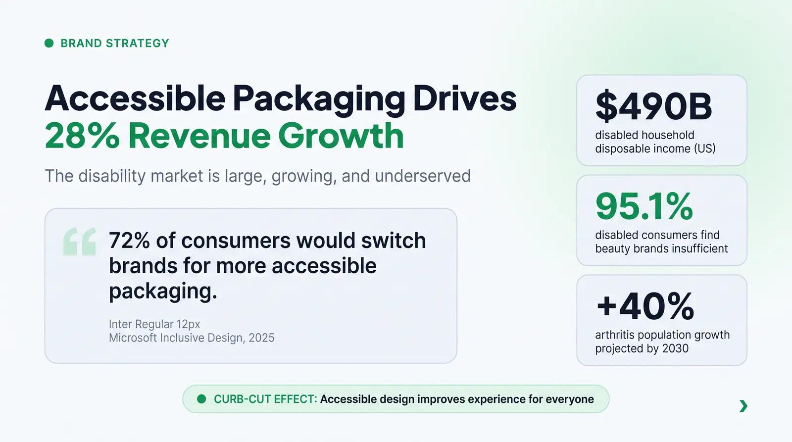
Accessibility in cosmetic packaging is no longer a niche consideration or a charitable afterthought. It is a fundamental requirement for a well-designed product. With 1.5 billion people globally living with chronic pain, and arthritis affecting nearly 60 million adults in the United States alone [1], the disability community represents a massive, underserved demographic. In the US, disabled households command $490 billion in disposable income [2]. Furthermore, an overwhelming 95.1% of disabled customers feel there are not enough accessible beauty brands on the market [2]. Founders who prioritize inclusive design unlock significant market opportunity while solving genuine pain points for their customers.
Designing accessible packaging requires moving beyond aesthetic trends and focusing on functional ergonomics. It demands a rigorous evaluation of how users interact with the primary packaging, from the initial unboxing to the daily dispensing of the product. This article provides a practical framework for evaluating the usability of pumps, droppers, caps, and tubes, enabling beauty brand founders to make informed sourcing decisions that serve the broadest possible audience.
Why Packaging Usability Is a Founder's Problem, Not Just a Designer's
Most conversations about accessible packaging focus on large brands with dedicated R&D teams and the capital to commission custom molds. That framing misses the real opportunity. Smaller, independent brands are actually better positioned to make accessibility-first packaging decisions because they are choosing from a catalog of existing SKUs rather than engineering custom components from scratch. Every packaging selection is a usability decision, whether a founder treats it that way or not.
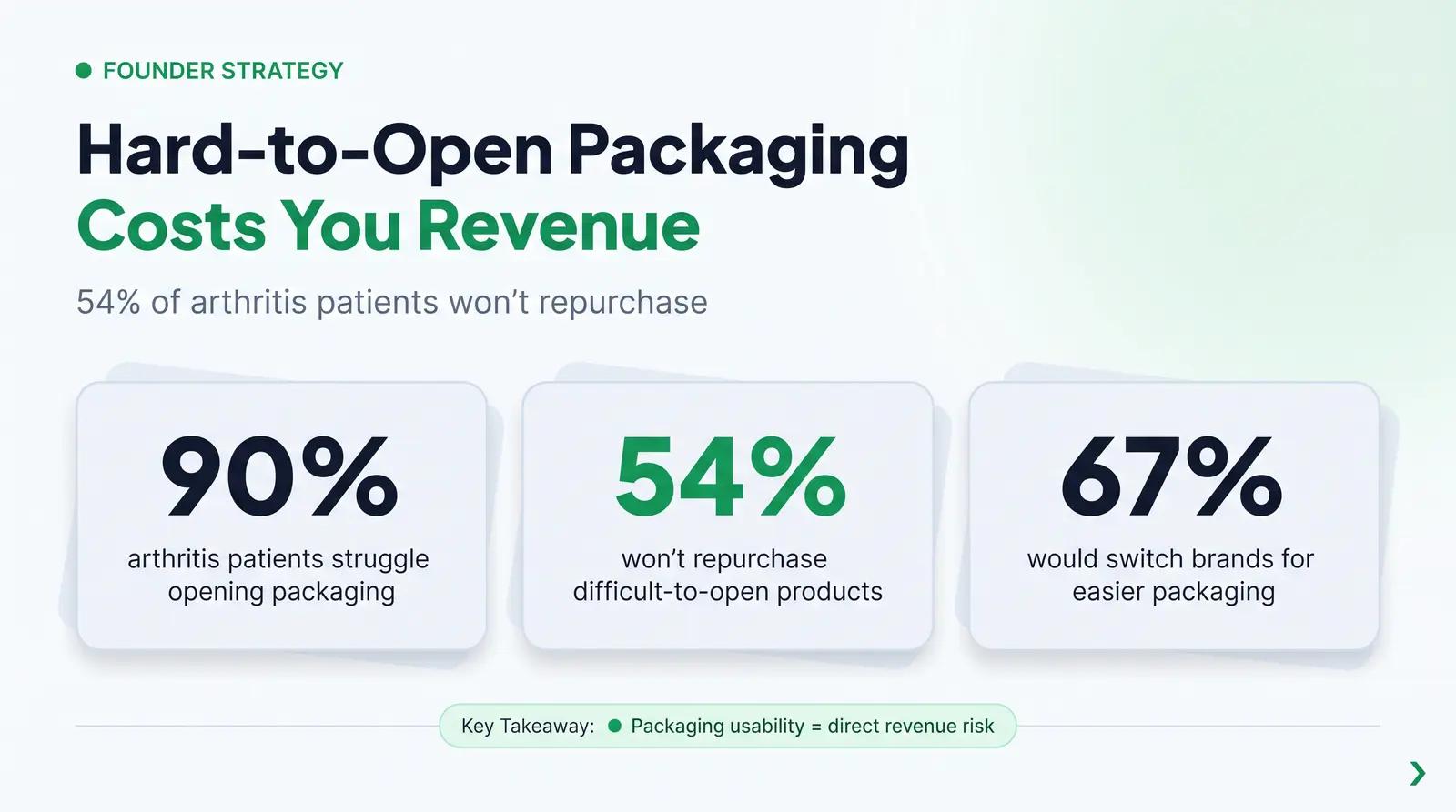
According to a 2024 study by Stable Kernel cited by the Arthritis Foundation, 90% of arthritis patients and 68% of general consumers struggle with opening packaging, often resulting in injuries such as cuts, bruises, or chipped teeth [1]. More pointedly, 54% of arthritis patients reported they would not repurchase products with difficult-to-open packaging, and 67% said they would consider switching brands if a competitor offered easier-to-use packaging [1]. These numbers reflect a direct revenue risk, not a theoretical design concern.
The disability and aging consumer market is also growing. The Arthritis Foundation projects a 40% growth in the arthritis population by 2030 [1]. The anti-aging skincare segment, which skews heavily toward consumers over 50, is one of the fastest-growing categories in beauty. Brands that design for accessibility now are building toward the demographics that will dominate the market in the next decade.
The Packaging Usability Evaluation Rubric
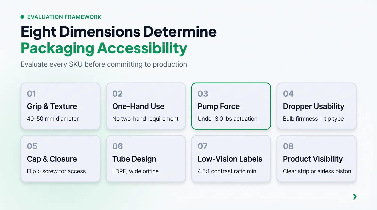
To systematically assess the accessibility of cosmetic primary packaging, we recommend applying a structured evaluation framework before finalizing any SKU selection. The Packaging Usability Evaluation Rubric provides concrete parameters for assessing grip, actuation, closure mechanics, and readability. By evaluating potential packaging options against these dimensions, founders can identify and eliminate barriers to use before committing to a production run.
The rubric covers eight dimensions, each with specific thresholds or design principles drawn from ergonomics research and accessibility standards.
Dimension 1: Grip and Surface Texture
The ability to securely hold and manipulate a container is the first hurdle in the user experience. For users with arthritis, fine motor limitations, or simply wet hands in a bathroom environment, a smooth, narrow bottle can be impossible to manage.
Grip diameter is a critical factor. Research from the Arthritis Foundation indicates that users with arthritis experience diminishing grip strength when the grip span exceeds 2.5 to 3.0 inches [3]. A bottle with a diameter of 40 to 50mm (roughly 1.6 to 2 inches) sits comfortably in the palm for most adult hand sizes, allowing the user to engage the larger, stronger muscles of the forearm rather than relying on isolated finger joints. Bottles narrower than 30mm (approximately 1.2 inches) are difficult to grip securely, especially when wet.
Surface material and texture play equally important roles. High-gloss, smooth finishes offer minimal friction, requiring a tighter grip that can cause pain for users with joint inflammation. Incorporating knurling, ribbing, or a matte, soft-touch finish significantly improves grip security without requiring excessive force. These tactile elements provide the necessary friction to allow users to hold the product comfortably, even when their hands are slick with serum or moisturizer. Dr. Bryce Rutter, an ergonomic design expert, notes that frustration-free packaging must accommodate fingernails, which project beyond the fingertips and dramatically change dexterity and sensory feedback, a factor particularly relevant for beauty packaging [4].
Dimension 2: One-Hand Operability
The capacity to operate a product with one hand is a hallmark of accessible design. Many users face situational or permanent limitations that restrict the use of both hands simultaneously. A parent holding an infant, a person with a neurological condition affecting one side of the body, or simply someone who has just applied a product to one hand all need packaging that works with one hand.
Pumps and flip caps generally support one-handed use. A user can rest the bottle on a counter and depress a pump, or use a thumb to flick open a flip cap. Conversely, screw caps and traditional droppers typically demand two hands: one to stabilize the base and the other to twist the cap or squeeze the bulb. When evaluating packaging, founders must consider whether the required interaction sequence forces a two-handed operation and whether that aligns with the intended use context.
Dimension 3: Pump Force and Actuation
Pumps are frequently praised for their convenience, but not all pumps are created equal. The actuation force, which is the amount of pressure required to depress the pump head, is a vital accessibility metric. The Arthritis Foundation recommends that design elements meant to be operated with a single finger require less than 3.0 pounds of linear force, and less than 5.0 pounds for a palm press [3].
Beyond the force required, the pump stroke volume and the physical design of the actuator head impact usability. A pump that dispenses too little product forces the user to perform repetitive actuations, causing fatigue. A pump head with a broad, slightly concave surface area allows users to distribute the required force across multiple fingers or the palm, rather than concentrating the pressure on a single fingertip. When reviewing a pump spec sheet, founders should look for the stated actuation force in pounds or Newtons, the stroke volume in microliters (mcl), and the actuator head diameter. For serums and facial oils, a stroke volume under 100 mcl is appropriate; for face lotions and light creams, 100 to 250 mcl is the standard range [11].
Dimension 4: Dropper Usability
Droppers are a staple for serums and facial oils, often associated with premium, clinical aesthetics. However, their accessibility profile is more complex than their reputation suggests.
A common assumption is that dropper bottles are more precise and therefore better for serums targeting older or arthritic users who need exact dosing. The reality is the opposite. Droppers actually require more fine motor control than pumps. Squeezing a rubber bulb with consistent pressure, holding the pipette steady, and releasing the liquid at the precise moment are all challenging tasks for users with tremors, arthritis, or reduced grip strength [4]. Furthermore, the flow of liquid from a dropper is highly dependent on the applied pressure, leading to dosage errors of up to 25% [5]. A well-specified airless pump, offering a low actuation force and a consistent dose per stroke, is typically much more accessible for this population. The dropper's reputation for precision is largely a marketing convention rather than a genuine usability advantage for users with limited dexterity.
When droppers are necessary, bulb firmness and tip diameter must be carefully evaluated. A softer bulb reduces the required pinch force. A ball tip can deliver a more consistent drop size regardless of the dispensing angle, making it the preferred choice for applications where dosing consistency matters [6]. A bent tip offers more targeted dispensing for users who need to direct the product to a specific area, such as a facial serum applied to the eye contour.
Dimension 5: Cap and Closure Types
The choice of closure significantly impacts the effort required to access the product. Different closure types present distinct challenges and advantages depending on the user's physical capabilities and the use context.
Screw caps require a twisting motion that can be painful or impossible for users with arthritis or limited wrist mobility. The rotational force required is often high, and smooth caps exacerbate the difficulty [3]. If a screw cap is necessary, it should feature deep ribbing or a textured overshell to improve grip and reduce the torque required to open it. Avoid small-diameter screw caps, as the leverage available to the user decreases with the cap's diameter.
Flip caps are generally more accessible than screw caps because they allow for one-handed operation. However, the hinge stiffness and the size of the thumb indent are critical variables. A stiff hinge or a tiny indent that requires a fingernail to pry open will frustrate users and potentially cause injury [4]. Founders should physically test the flip cap with a sample before ordering, specifically checking whether the hinge can be opened with a thumb pad rather than a fingernail.
Press-to-open disc top caps operate via a lever or pressure motion, offering easier access compared to traditional screw caps [7]. They are often suitable for users with limited dexterity, provided the required pressure is low and the press area is large enough to engage with the palm.
Snap closures and press-to-open mechanisms that require simultaneous actions, such as pressing and twisting at the same time, should be avoided for any product targeting users with arthritis or limited dexterity. The Arthritis Foundation specifically flags simultaneous actions as a significant barrier [3].
Dimension 6: Tube Design
Squeeze tubes are ubiquitous for cleansers, masks, and thick creams, but their usability changes dramatically as the product is depleted. The initial squeeze force required for a full tube is usually low, but as the tube empties, the stiffness of the plastic and the location of the remaining product make dispensing increasingly difficult. A user with limited hand strength may be unable to extract the last third of the product from a stiff tube.
The shoulder angle and orifice size also affect accessibility. A wide orifice allows thick products to dispense with less pressure, while a narrow orifice requires a harder squeeze. Choosing a softer, more pliable tube material, such as low-density polyethylene (LDPE), helps ensure that users can extract the product without experiencing hand fatigue or joint pain. Tubes with a flat, wide body are easier to roll and squeeze than round tubes, as the flat geometry allows the user to apply force along the full width of the hand.
Dimension 7: Low-Vision and Tactile Readability
Visual accessibility is a critical component of inclusive packaging that is frequently overlooked in favor of aesthetics. Tiny fonts, low-contrast color schemes, and glossy reflective labels render critical information unreadable for users with low vision or aging eyes.
To ensure readability, founders should adhere to established accessibility standards. The Web Content Accessibility Guidelines (WCAG) recommend a minimum contrast ratio of 4.5:1 for normal text and 3:1 for large text at Level AA compliance [8]. While WCAG was developed for digital interfaces, the underlying principle, that text must be sufficiently differentiated from its background to be legible for people with moderately low vision, applies directly to printed packaging. A black label with white text, or a white label with dark text, will always outperform a pastel-on-pastel color scheme for readability.
The FDA mandates that ingredient text must be no smaller than 1/16 inch in height on cosmetic labels, or 1/32 inch if the total package surface is less than 12 square inches [9]. These are legal minimums, not accessibility targets. For a product targeting users over 50, a font size of at least 8 to 10 points on the primary label, combined with a matte finish to reduce glare, is a practical baseline. Tactile indicators, such as embossed symbols or Braille, can further assist visually impaired users in identifying and orienting the product.
Dimension 8: Product Visibility
The opacity of the packaging affects both usability and consumer trust. Clear or frosted packaging allows users to easily see the remaining product volume, enabling them to anticipate when a replacement is needed. This visual cue is particularly helpful for users with cognitive or memory challenges who may otherwise lose track of how much product remains.
Completely opaque packaging hides the product level. While opaque containers are necessary to protect light-sensitive ingredients like Vitamin C or retinol from degradation, brands can mitigate the usability impact by incorporating a clear viewing strip or utilizing an airless pump system where the rising piston visually indicates the remaining volume. For products where opacity is non-negotiable, consider adding a tactile fill indicator or a simple graduated scale to the label.
Inclusive Packaging as a Brand Strategy Decision
Choosing accessible packaging is not merely a compliance exercise. It is a strategic brand decision with measurable commercial implications.
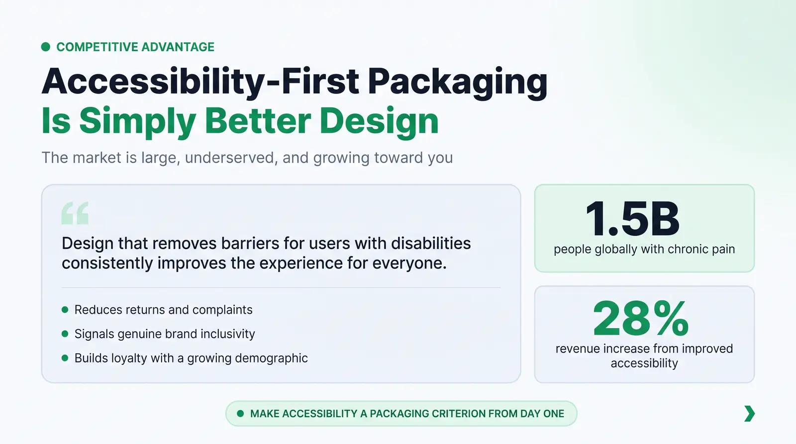
The aging population and the disability community represent a vast market segment with significant and growing purchasing power. When 72% of consumers state they would switch brands if a product or package was demonstrably more accessible [10], the business case for inclusive design is undeniable. Companies that improve the accessibility of their products see a 28% increase in revenue, according to data cited by Microsoft's Inclusive Design team [10]. Brands that proactively address packaging usability differentiate themselves in a crowded market and build a reputation for genuine consumer care.
Tilt Beauty became the first beauty brand to earn the Arthritis Foundation's Ease of Use Certification, a milestone that generated significant press coverage and positioned the brand as a leader in accessible cosmetics [1]. For an independent founder, the path to that kind of differentiation does not require a custom mold or a research partnership. It requires applying a usability framework at the SKU selection stage, before production begins.
The "curb-cut effect" is relevant here: design that removes barriers for users with disabilities consistently improves the experience for everyone. Easy-to-open packaging helps people with arthritis, but it also benefits anyone who values convenience, anyone applying products in a hurry, and anyone whose hands are wet or cold. Accessible design is simply better design.
For a deeper look at how packaging material choices affect both usability and sustainability, see our cosmetic packaging materials guide. For a detailed comparison of airless pump and dropper formats across formula types, see our guide to airless pump vs. dropper packaging.
Comparing Packaging Formats: Usability Trade-offs at a Glance
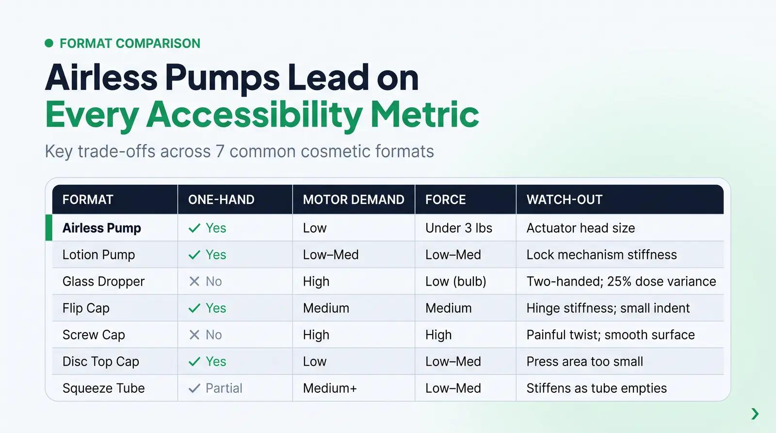
The following table compares the accessibility profiles of common cosmetic primary packaging formats across the key usability dimensions covered in the rubric.
| Packaging Format | One-Hand Use | Motor Control Required | Typical Actuation Force | Best Formula Types | Key Accessibility Watch-outs |
|---|---|---|---|---|---|
| Airless Pump | Yes | Low | Low (target under 3.0 lbs) | Serums, vitamin C, retinol, light creams | Actuator head too small; actuation force not specified in SKU |
| Lotion Pump | Yes | Low to Medium | Low to Medium | Face lotions, body lotions, cleansers | Requires locking mechanism to be disengaged; can be stiff |
| Glass Dropper | No | High (pinch + steady hand) | Low (bulb squeeze) | Facial oils, fluid serums | Two-handed; high dosage variance; difficult for arthritic users |
| Flip Cap (Tube or Bottle) | Yes | Medium (thumb pressure) | Medium | Cleansers, shampoos, body lotions | Stiff hinge; thumb indent too small for fingertip engagement |
| Screw Cap (Jar or Bottle) | No | High (grip + twist) | High | Thick creams, balms, masks | Painful rotational force; smooth surfaces lack grip |
| Disc Top Cap | Yes | Low (press) | Low to Medium | Toners, liquid exfoliants, lightweight serums | Press area too small; high resistance in some designs |
| Squeeze Tube | Yes (full tube) | Medium (increases as tube empties) | Low to Medium | Cleansers, masks, thick creams | Stiff material; narrow orifice; difficult to empty |
A Worked Example: Choosing Packaging for a 55+ Demographic
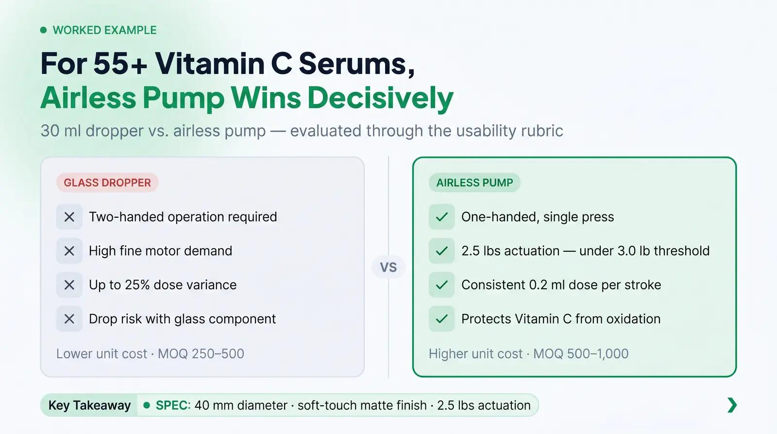
Consider a founder launching a new 1 oz (30 ml) Vitamin C serum specifically formulated for consumers over the age of 55. The founder is debating between a traditional 30ml glass dropper bottle and a 30ml airless pump, and needs to make a decision before placing a first production order.
Evaluating the options through the Packaging Usability Evaluation Rubric reveals clear distinctions. The target demographic is more likely to experience diminished grip strength, mild arthritis, or reduced fine motor control. The glass dropper requires a multi-step, two-handed operation: holding the bottle steady, unscrewing the cap, squeezing the bulb, transferring the pipette to the hand or face, and releasing the pressure at the right moment. This sequence demands significant dexterity and introduces a high risk of dropping the glass component or spilling the product. The dosage variance with a dropper can be up to 25% per application [5], meaning the user cannot reliably control how much product they are dispensing.
In contrast, an airless pump offers a one-handed, single-press operation. If the founder specifies a pump with an actuation force of approximately 2.5 lbs, which sits comfortably within the Arthritis Foundation's recommended threshold of under 3.0 lbs for single-finger operation [3], the physical barrier to entry is virtually eliminated. The airless pump delivers a consistent 0.2ml dose per stroke, and the vacuum-sealed mechanism prevents oxidation of the Vitamin C formula, extending shelf life without requiring preservatives [5].
On the cost side, the glass dropper bottle may have a lower unit cost and a lower MOQ (often 250 to 500 units), while the airless pump typically carries a higher unit cost and an MOQ of 500 to 1,000 units. For a founder launching at a small scale, this is a real trade-off. However, the usability benefits for the 55+ demographic, combined with the formula protection advantages of the airless format, make the pump the stronger choice for this specific product and audience. The founder decides on a 40mm diameter airless pump bottle, providing a comfortable palm grip that avoids the strain of holding a narrow container, and specifies a soft-touch matte finish to improve grip security.
Applying the Rubric Before You Order
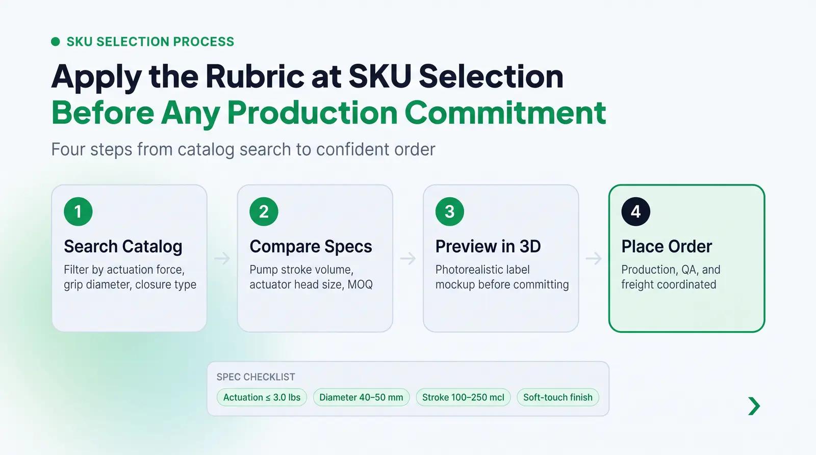
The Packaging Usability Evaluation Rubric is most useful when applied at the SKU selection stage, before any production commitment is made. At Packfolio, the curated packaging catalog surfaces critical specifications such as pump stroke volume, actuation force, grip diameter, and closure type directly in the SKU details. This means founders can apply the rubric to real options, compare formats side by side, and preview their label design on a photorealistic 3D model before finalizing an order. Packfolio coordinates production, quality assurance, and freight, so founders do not need to manage supplier relationships or factory vetting to access well-specified, accessible packaging.
Closing: Accessible Packaging Is a Competitive Advantage
Accessible beauty packaging sits at the intersection of thoughtful design and practical engineering. By prioritizing grip, actuation force, one-hand operability, and label readability, founders can create products that are a genuine pleasure to use for the widest possible audience. Moving away from frustrating closures and demanding dispensers not only reduces customer complaints and returns but also signals a brand's commitment to real inclusivity, the kind that shows up in the product itself rather than in marketing copy.
The market data is unambiguous. The population of consumers who benefit from accessible packaging is large, growing, and underserved. Founders who make accessibility a packaging criterion from day one are building brands that will age well.
Frequently Asked Questions
What makes cosmetic packaging accessible for people with arthritis or limited dexterity? Accessible packaging for arthritis minimizes the need for high grip strength, pinching, or twisting. Features like low-force pumps (under 3.0 lbs actuation force), wide flip caps with generous thumb indents, and textured or soft-touch surfaces that prevent slipping are essential. The goal is to allow operation using the palm or the whole hand rather than relying on isolated finger joints, which are often the source of pain for arthritis sufferers.
Is a pump or dropper better for skincare serums in terms of ease of use? A pump is generally much better for ease of use. Droppers require significant fine motor control to squeeze the bulb with consistent pressure and stabilize the pipette, which is difficult for users with tremors or reduced dexterity. A well-designed airless pump allows for simple, one-handed operation and delivers a consistent dose with minimal effort, making it the more accessible choice for the majority of users.
What font size should cosmetic labels use to be readable for low-vision consumers? The FDA requires ingredient text to be no smaller than 1/16 inch in height on standard cosmetic labels, or 1/32 inch for packages with less than 12 square inches of surface area [9]. For true accessibility, brands should exceed these minimums, use clean sans-serif fonts, and ensure a high contrast ratio of at least 4.5:1 between the text and the background, following the WCAG Level AA standard [8].
How do I choose between a flip cap and a screw cap for my beauty product? Whenever possible, choose a flip cap. Flip caps allow for one-handed opening and do not require the painful twisting motion associated with screw caps, making them far more accessible for users with arthritis or limited wrist mobility. If a screw cap is necessary, ensure it has deep ribbing or a textured surface to aid grip, and avoid small-diameter caps that reduce the mechanical advantage available to the user.
What is the Arthritis Foundation Ease of Use Certification and how does it apply to beauty packaging? The Ease of Use Certification is awarded to products and packaging that have been independently tested and proven easy to open and operate for people with arthritis and chronic pain. In beauty packaging, this means the components meet specific thresholds for linear and rotational force, ensuring they do not cause joint pain during daily use. Tilt Beauty became the first beauty brand to earn this certification, demonstrating that it is achievable for independent beauty brands, not just large corporations [1].
References
[1] Innovative Design: The Impact of Ease of Use in Product and Packaging Design. Packaging Technology Today. 2025. https://www.packagingtechtoday.com/featureds/innovative-design-the-impact-of-ease-of-use-in-product-and-packaging-design/
[2] Accessible beauty: The $8T opportunity brands overlook. Arbelle. 2025. https://arbelle.ai/accessible-beauty-and-ar-tech/
[3] Ease of Use Rigid Packaging Guide: Components. Arthritis Foundation. https://www.arthritis.org/getmedia/d390375f-8a63-4f1c-b4e6-f4f71c19c237/arthritisfoundation_components-final-print.pdf
[4] Designing Packaging To Match Hand Dexterity. Packaging Strategies. 2017. https://www.packagingstrategies.com/articles/94055-designing-packaging-to-match-hand-dexterity
[5] Airless Pump vs. Dropper Bottles: Which Is Best for Your Skincare. HCC Packaging. 2025. https://hccpackaging.com/airless-pump-vs-dropper-bottles-which-is-best-for-your-skincare/
[6] Understanding Dropper Assemblies: A Focus on Tip Styles. O.Berk. 2024. https://www.oberk.com/packaging-crash-course/dropper-assembly-tip-styles
[7] How Bottle Cap Choice Defines Your Product's User Experience. OthilaPak. 2025. https://othilapak.com/blogs/design-aesthetics/how-bottle-cap-choice-defines-your-products-user-experience/
[8] Understanding Success Criterion 1.4.3: Contrast (Minimum). W3C Web Accessibility Initiative. https://www.w3.org/WAI/WCAG22/Understanding/contrast-minimum
[9] Cosmetics Labeling Guide. U.S. Food and Drug Administration. 2022. https://www.fda.gov/cosmetics/cosmetics-labeling-regulations/cosmetics-labeling-guide
[10] Creating Accessible Packaging: An Inclusive Design Guide. Microsoft Inclusive Design. 2025. https://inclusive.microsoft.design/tools-and-activities/CreatingAccessiblePackaging.pdf
[11] Packaging Pitfalls: Top 3 Watchouts for Cosmetic Pumps. Impacked Packaging. 2025. https://www.impackedpackaging.com/blog/expertise/post/packaging-pitfalls-top-3-watchouts-for-cosmetic-pumps


