
Packaging Proofs for Beauty Brands: What to Approve Before Production
Beauty brands must approve color accuracy, label placement, closure fit, decoration quality, and regulatory copy on both digital and physical packaging proofs before releasing bulk production.
Approving a packaging proof is the single checkpoint that stands between a founder and a costly, unrecoverable bulk-order mistake. When a beauty brand moves from formulation to full-scale manufacturing, the physical container is often the most expensive and lead-time-heavy component of the launch. A misaligned label, a closure that leaks, or a brand color that prints muddy can force an entire production run into the landfill, delaying launches by months and draining capital that most independent brands cannot afford to lose.
For independent beauty brand founders, formulators, and contract manufacturers sourcing cosmetic primary packaging, mastering the proof approval process is not optional. It is the discipline that separates brands that launch cleanly from those that spend their first quarter managing reprints, relabeling, and regulatory corrections. This guide covers exactly what you must review, test, and formally approve before greenlighting a full production run. For a broader introduction to sourcing cosmetic primary packaging, see our complete cosmetic packaging guide.
Why the Proof Stage Is Non-Negotiable
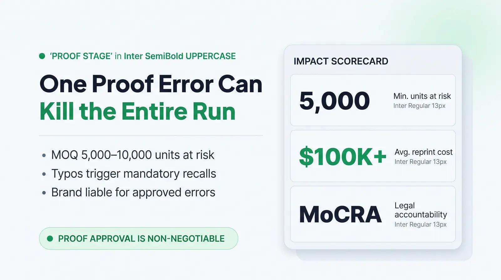
Skipping or rushing proof approval is a gamble with high financial and compliance stakes. The minimum order quantity (MOQ) for custom cosmetic packaging often ranges from 5,000 to 10,000 units for decorated components. If a mistake is caught after production begins, the brand is liable for the entire run, and the supplier is rarely obligated to absorb the cost of a client-approved error.
Packaging errors are surprisingly common. A small typo on packaging can cost beauty brands hundreds of thousands of dollars in lost products and significant material waste [1]. Pacifica Beauty, for instance, once discovered a two-letter typo on thousands of holiday gift boxes after production had run. They turned it into a sustainability campaign, but most independent brands cannot absorb that kind of loss or pivot that quickly [1]. Reprints force entire runs to be scrapped, with costs rising further for premium finishes like foil or embossing, plus added launch delays [2].
Beyond financial loss, regulatory compliance is a strict barrier. In regulated categories like cosmetics, labeling errors can trigger mandatory recalls, costing brands through logistics, destroyed stock, retailer penalties, and reputational damage [2]. Under the Modernization of Cosmetics Regulation Act of 2022 (MoCRA), the responsible person, meaning the manufacturer, packer, or distributor whose name appears on the label, is legally accountable for label accuracy [12]. The proof stage is where you catch the missing net weight declaration, the illegible ingredient list, or the unsubstantiated claim before it becomes a legal liability.
The Two Proof Types: Digital vs. Physical
The approval process involves two distinct types of proofs: the digital proof (also called the artwork proof or dieline) and the physical pre-production sample (PPS). Understanding what each covers is critical for a smooth transition to manufacturing.
Digital Proofs
A digital proof is a to-scale schematic, typically a PDF, showing how your artwork will be laid out on the container's dieline. It confirms creative accuracy, copy, regulatory compliance, and technical readiness of the file [2]. When reviewing a digital proof, check the following elements. The bleed should extend approximately 3.175 mm (1/8 inch) beyond the trim line to prevent white edges on the finished label [3]. The safe zone keeps critical text and logos at least 2 mm inside the trim line, away from the cutting edge [4]. The resolution must be a minimum of 300 DPI at final print size. The color mode should be CMYK or Pantone, not RGB, which is a screen-only color space [2].
Physical Pre-Production Samples
A physical PPS is an actual prototype of your packaging. While a digital proof verifies layout, a physical proof reveals what a screen cannot: tactile feel, closure torque, label adhesion, material translucency, and true color appearance under real lighting conditions. For any first-time custom packaging order, custom color, or new structural component, a physical PPS is non-negotiable.
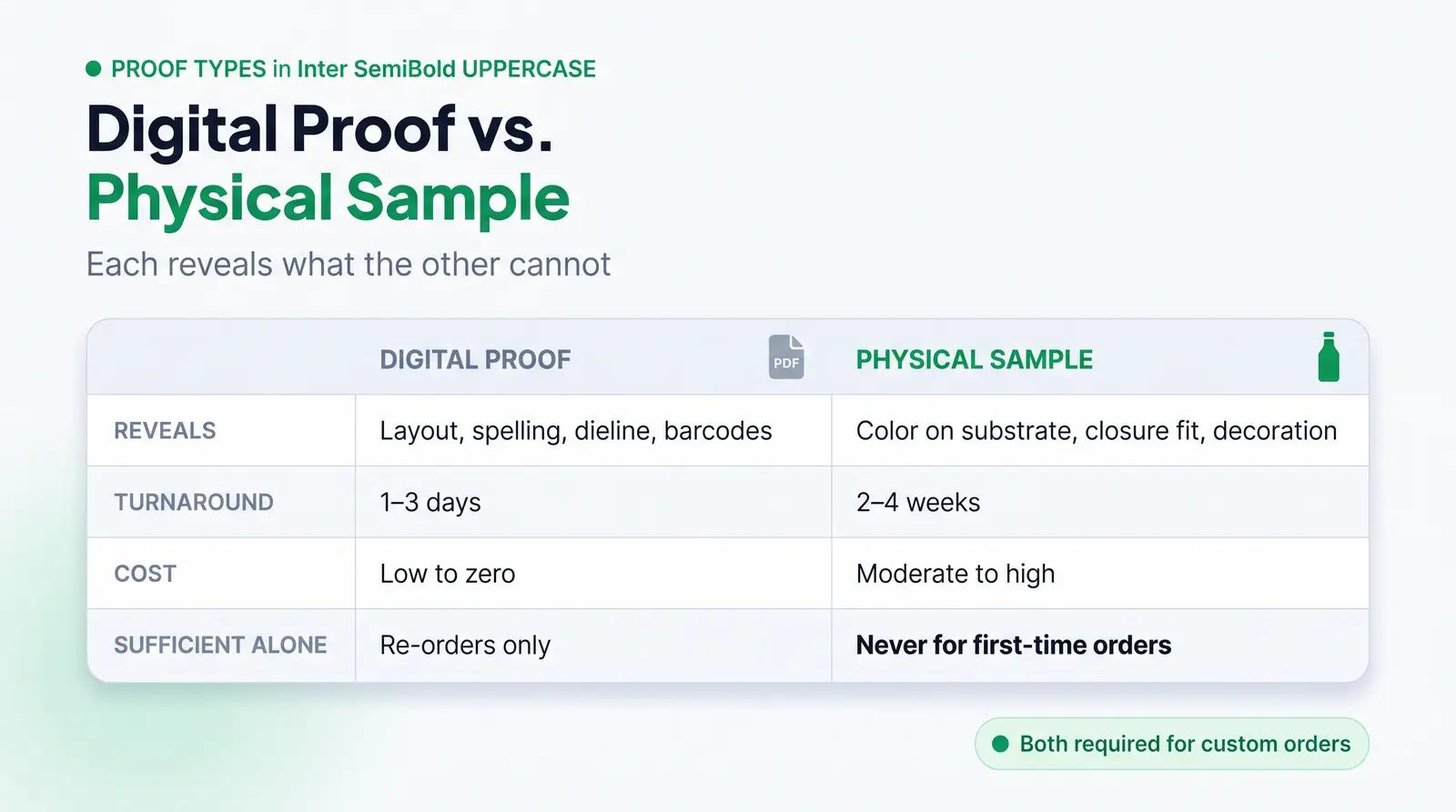
The table below summarizes the key differences between the two proof types.
| Feature | Digital Proof | Physical Pre-Production Sample |
|---|---|---|
| What It Reveals | Layout, spelling, regulatory copy, dieline accuracy, barcode placement | Tactile feel, actual color on substrate, closure fit, decoration quality, label adhesion |
| Turnaround Time | 1 to 3 days | 2 to 4 weeks depending on tooling requirements |
| Cost | Low to zero | Moderate to high, often with sample tooling fees |
| When Sufficient Alone | Re-orders with no artwork or structural changes | Never for first-time custom packaging or new decorations |
| Regulatory Copy Review | Primary stage for checking all mandatory declarations | Secondary stage to confirm legibility at actual print size |
| Decoration Defect Detectability | Cannot detect foil flaking, soft-touch issues, or metamerism | Essential for detecting all physical decoration and material defects |
Color Verification: Pantone, CMYK, and the Delta-E Tolerance Standard
Color accuracy in packaging means that the color printed on a finished package matches the brand's specified standard across every substrate and production run [5]. Achieving this requires understanding the difference between process colors and spot colors, and measuring variance using the Delta-E standard.
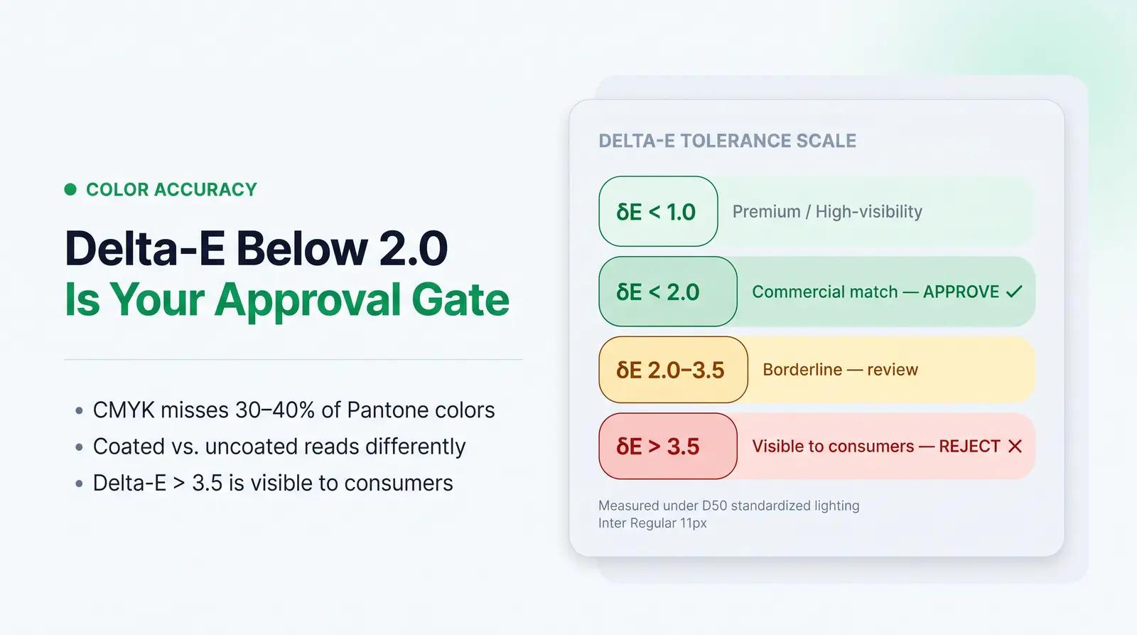
Most commercial printing uses CMYK, which mixes dots of ink to create colors. However, CMYK cannot reproduce approximately 30 to 40 percent of the colors in the Pantone library, especially vibrant or saturated hues [5]. For brand-critical solid colors, the Pantone Matching System (PMS) uses pre-mixed spot inks to produce a specific color regardless of the equipment used [5]. Note that Pantone publishes separate guides for coated (C) and uncoated (U) substrates because the same ink reads differently on different surfaces: a coated surface reflects light cleanly, making colors appear brighter and more saturated, while an uncoated surface absorbs more ink, making colors appear softer and muted [5].
To measure how close a printed color is to the target, the industry uses Delta-E (ΔE), a numerical measurement of the perceptible difference between two colors in a three-dimensional CIELAB color space [5] [6]. The modern standard is the Delta-E 2000 (dE00) formula, which adjusts weighting to better align with human visual perception.
A Delta-E of 1.0 is generally considered the threshold of human perception under controlled viewing conditions [5]. For most commercial prime labels, a tolerance of Delta-E less than 2.0 is the standard for critical brand colors, representing a "commercial match" where the difference is generally imperceptible to a consumer viewing the product in isolation [6]. High-visibility, premium products may demand very low ΔE values under 1.0, while less critical elements such as background tints may allow up to 3.0 [7]. Once values exceed 3.5, the difference is visible to most consumers and is unacceptable for brand-critical colors [5].
When a printed sample falls outside your specified tolerance, reject it. Request that the supplier adjust the ink formulation, recalibrate the press, or account for the substrate's base color shift before resubmitting.
Label Placement and Print Tolerance
A beautifully designed label loses its impact if it is applied crookedly or if the print drifts off the edge. When reviewing proofs, you must account for the cumulative physical tolerances of the slitting and application machinery, not just the design file.
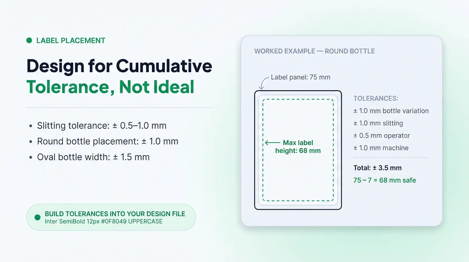
The label manufacturer should advise of the slitting tolerance of the web they can achieve, which is often +/- 0.5 mm or 1.0 mm [8]. Label application machinery also has placement tolerances. For round bottles, the variation in label placement is typically within +/- 1.0 mm [8]. For oval bottles, the variation in label placement width-wise will be within +/- 1.5 mm, while height variation remains within +/- 1.0 mm [8].
When approving your digital proof, ensure your design accommodates these cumulative shifts. The size of the label must not exceed the defined label panel less the sum of all tolerances [8]. For example, if your round bottle has a label panel height of 75 mm, and the combined tolerances of bottle variation (+/- 1.0 mm), slitting (+/- 1.0 mm), operator skill (+/- 0.5 mm), and machine application (+/- 1.0 mm) total +/- 3.5 mm, your maximum label height should be 68 mm to ensure it fits perfectly every time [8].
For wrap labels on round containers, also verify that the wrap alignment is consistent. The label's leading edge and trailing edge should meet cleanly, with no visible gap or overlap.
Closure Fit and Functional Testing
A stunning glass bottle is useless if the serum leaks during transit because the cap was not engineered to the correct torque specification. Closure fit and functional testing must be performed on the physical pre-production sample.
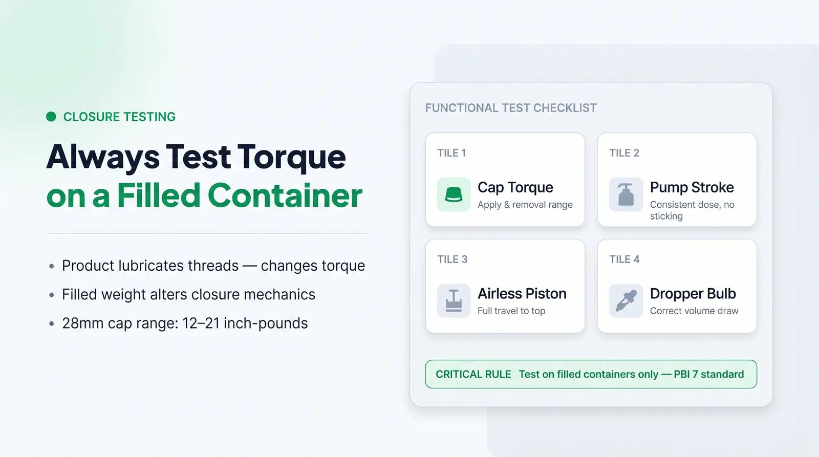
Testing includes evaluating cap torque, snap-fit feel, pump stroke, airless piston travel, and dropper bulb compression. Crucially, these tests must be performed on a filled container, not an empty one. The Method of Test for Closure Torque, developed by the Plastic Bottle Institute of the Society of the Plastics Industry (Technical Bulletin PBI 7), requires that testing be performed with the containers filled with their usual contents to accurately simulate real-world physics [9]. Product on the threads can act as a lubricant, and the weight of a filled bottle changes the mechanical behavior of the closure system.
Application torque specifications are expressed as a range of acceptable outcomes [9]. For instance, a 28 mm cap might have a general torque guideline of 12 to 21 inch-pounds, but specific manufacturer guidelines must always be followed over general charts [9]. A functional failure caught at the proof stage saves you from a total loss at bulk receipt, where thousands of leaking units would need to be destroyed or relabeled.
For airless pump components, test the piston travel by dispensing the product repeatedly until the piston reaches the top. Confirm the pump delivers a consistent dose and that the actuator does not stick or require excessive force.
Decoration Approval: Foil Stamping, Soft Touch, Screen Print, and Labeling
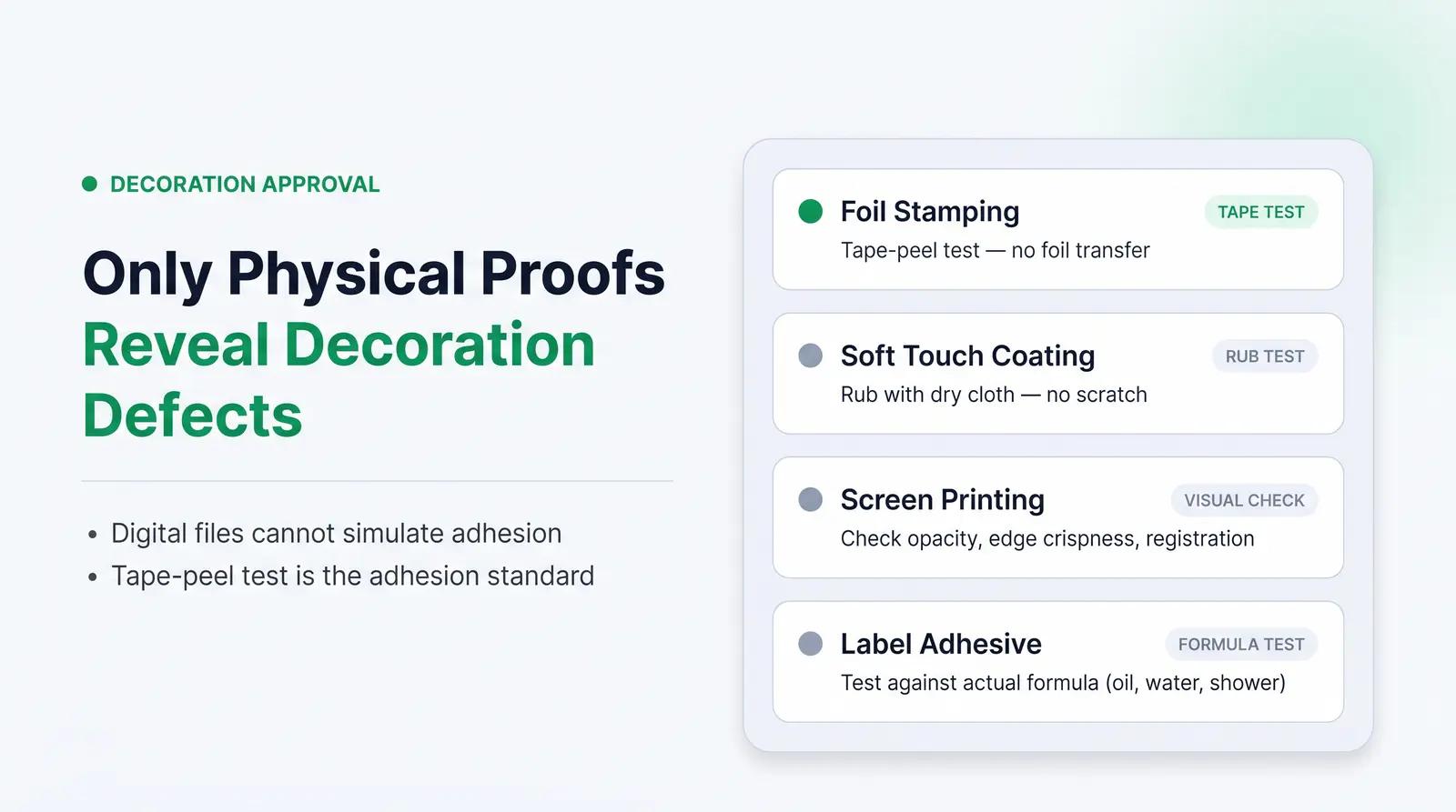
Specialty decorations elevate cosmetic packaging but introduce new vectors for defects that only a physical proof can reveal. Digital files cannot simulate how a coating adheres to a curved surface or how foil transfers under heat and pressure.
Foil Stamping: Used for metallic accents and premium logo details. Look for incomplete transfer, misalignment, or foil wrinkling [10]. Defects such as incomplete transfer, misalignment, or foil wrinkling are minimized through optimized tooling, stable web tension, and documented machine settings [10]. Test adhesion by performing a standard tape-peel test: apply a piece of pressure-sensitive tape firmly over the foil area and pull it off quickly. If foil transfers to the tape, the adhesion is insufficient.
Soft Touch Coating: Imparts a velvety, matte texture and is popular for premium skincare packaging. However, soft-touch finishes can dull the brightness of underlying colors and shift the perceived hue [11]. Ensure the coating has adhered properly and does not peel or scratch off easily. Rub the surface with a dry cloth to test rub resistance.
Screen Printing: Check for ink opacity, crisp edge detail, and rub resistance. Confirm that the print area, color count, and registration match the approved digital proof.
Labeling: Verify that the adhesive holds up under the expected environmental conditions of the product. Oil-based serums, water-based gels, and products used in shower environments all require specific adhesive formulations. A label that peels off in the shower is a customer experience failure.
Compliance and Regulatory Copy Review
Label proof sign-off is your final checkpoint for regulatory compliance. Under MoCRA and existing FDA regulations, cosmetic labels must meet strict, non-negotiable requirements [12] [13].
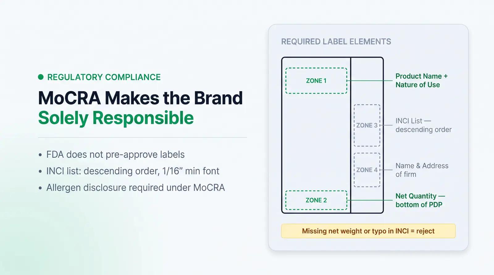
The Principal Display Panel (PDP), the part of the label most likely to be examined under customary conditions of display for sale, must state the name of the product, identify its nature or use, and bear an accurate statement of the net quantity of contents [13]. The net quantity declaration must be distinct, placed in the bottom area of the PDP, and in a type size commensurate with the size of the container [13].
The ingredient declaration must be conspicuous, with letters not less than 1/16 of an inch in height. If the total package surface available to bear labeling is less than 12 square inches, letters must not be less than 1/32 of an inch in height [13]. Ingredients must be declared in descending order of predominance [13]. MoCRA also requires companies to list specific fragrance components that are known allergens, ensuring these are clearly identified on the cosmetic label [14].
The name and place of business of the firm marketing the product must be stated on an information panel of the label, including street address, city, state, and zip code [13]. Under MoCRA's adverse event reporting requirements, the responsible person must also include a copy of the label on or within the retail packaging of the cosmetic product [12].
Always verify your copy against 21 CFR Part 701 and FTC Fair Packaging and Labeling Act rules before final sign-off. The FDA does not pre-approve cosmetic product labeling, which means the brand owner is solely responsible for compliance at the point of sale.
The Pre-Production Sign-Off Rubric
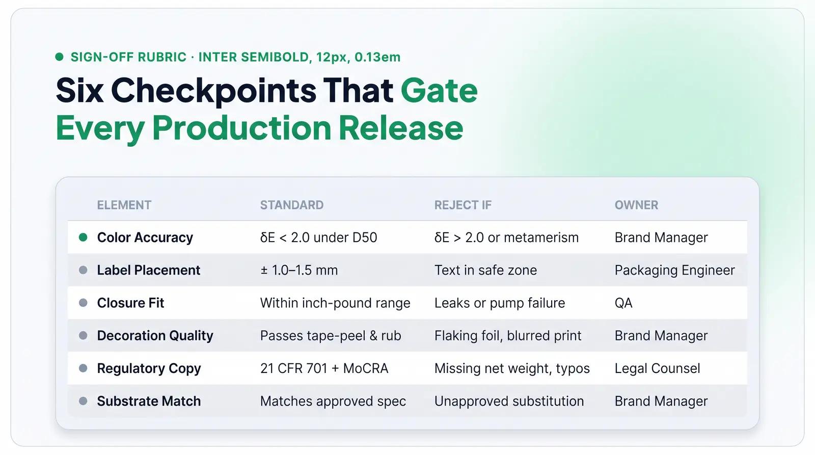
To systematize this process, use a structured decision framework. We recommend The Pre-Production Sign-Off Rubric at Packfolio to ensure no critical element is overlooked before releasing production. This framework is built from industry standards and regulatory requirements.
| Proof Element | What to Check | Acceptable Standard | Reject If | Sign-Off Owner |
|---|---|---|---|---|
| Color Accuracy | Target color match on actual substrate under D50 lighting | Delta-E less than 2.0 for brand-critical colors | Delta-E exceeds 2.0, or visible metamerism under retail lighting | Brand Manager or Creative Lead |
| Label Placement | Alignment, clear space, and fit within defined label panel | Within +/- 1.0 mm to 1.5 mm of specified placement | Text enters safe zone, label overlaps curves, or wrap gap is visible | Packaging Engineer or QA |
| Closure Fit | Application and removal torque on filled container | Within manufacturer's specified inch-pound range | Leaks, thread jumping, pump failure, or excessive removal force | Packaging Engineer or QA |
| Decoration Quality | Foil adhesion, screen print opacity, soft-touch durability, rub resistance | Passes tape-peel and rub tests with no transfer | Flaking foil, blurred print edges, coating that scratches off easily | Brand Manager or QA |
| Regulatory Copy | PDP elements, INCI list, net weight, allergen warnings, font size | Complies with 21 CFR Part 701 and MoCRA requirements | Missing net weight, font below 1/16 inch (unless exempt), typos in INCI | Regulatory or Legal Counsel |
| Substrate/Material Match | Tactile feel, translucency, base color shift, finish | Matches approved material specification and finish sample | Unapproved substitution, e.g., kraft board instead of white coated board | Brand Manager |
Worked Example: A Vitamin C Serum in a 1 oz Glass Dropper Bottle
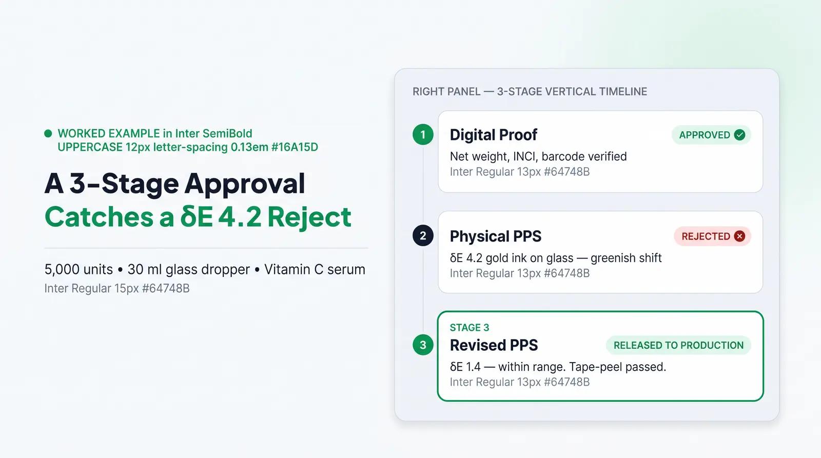
Consider a founder ordering 5,000 units of a 1 oz (30 ml) glass dropper bottle with a custom screen-printed label for a vitamin C face serum. Here is how the proof approval sequence plays out.
Stage 1: Digital Proof Review. The founder receives the PDF dieline. They check the safe zones and confirm the net weight is listed as "1 fl oz (30 ml)" on the bottom of the PDP, parallel to the base of the package, as required by 21 CFR 701.10 [13]. Legal counsel verifies the INCI ingredient list is spelled correctly and the font is exactly 1/16 of an inch high. The barcode scans correctly on screen. The digital proof is approved.
Stage 2: Physical PPS Review. Three weeks later, the physical samples arrive. The brand's signature gold color was specified as Pantone 871 C. The founder measures the color on the glass using a spectrophotometer and finds a Delta-E of 4.2, a greenish shift caused by the glass's natural tint interacting with the metallic ink. At this Delta-E level, the difference is clearly visible to most consumers [5]. Decision: Reject. They request the supplier adjust the ink formulation to account for the substrate's color shift.
They also fill the sample bottle with their serum and test the dropper closure. The bulb compresses smoothly, the pipette draws the correct volume, and the cap torques to the specified 15 inch-pounds without leaking. Decision: Accept.
Stage 3: Revised PPS and Final Sign-Off. A revised physical sample arrives two weeks later. The adjusted gold ink now measures a Delta-E of 1.4, well within the acceptable range. The screen print passes the tape-peel test with no transfer. The founder and their regulatory reviewer both sign and date the physical sample, officially releasing the 5,000-unit bulk order to production.
Common Proof Approval Mistakes (and How to Avoid Them)
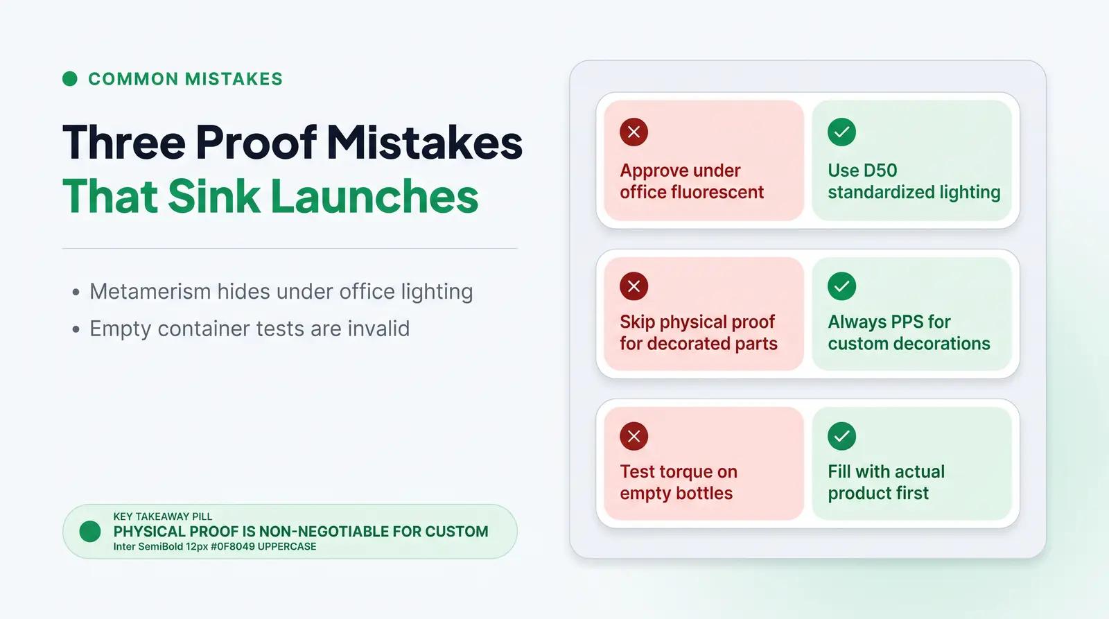
A non-obvious but critical mistake founders make is approving physical proofs under standard office fluorescent lighting. This leads to a phenomenon known as metamerism, where two colors appear to match under one light source but look drastically different under another [11] [15]. Packaging is often proofed under standard industrial D50 lighting (neutral white), but your customer might be viewing the product under the warm yellow lights of a living room or the harsh fluorescent lights of a retail shelf [11]. Different light sources reflect different wavelengths, causing the color to shift to the naked eye [11]. Always evaluate physical proofs under standardized D50 lighting, or at minimum view them under multiple light sources (daylight, retail fluorescent, and incandescent) before signing off.
A second common error is assuming digital proof approval alone is sufficient for decorated components, even when a supplier says it is. A digital screen cannot show you how a soft-touch coating will dull your brand color, how foil stamping will adhere to a curved plastic tube, or how a label adhesive will perform against an oil-based formula. Physical samples are non-negotiable for custom decorations.
A third mistake is testing closure fit on empty containers. The physics of a sealed container change when filled with product, especially liquids. Product on the threads can act as a lubricant, changing the torque dynamics, and the weight of a filled bottle changes the mechanical behavior of the closure system [9]. Always test torque and seal integrity on filled containers to simulate real-world conditions.
A Streamlined Proof Workflow
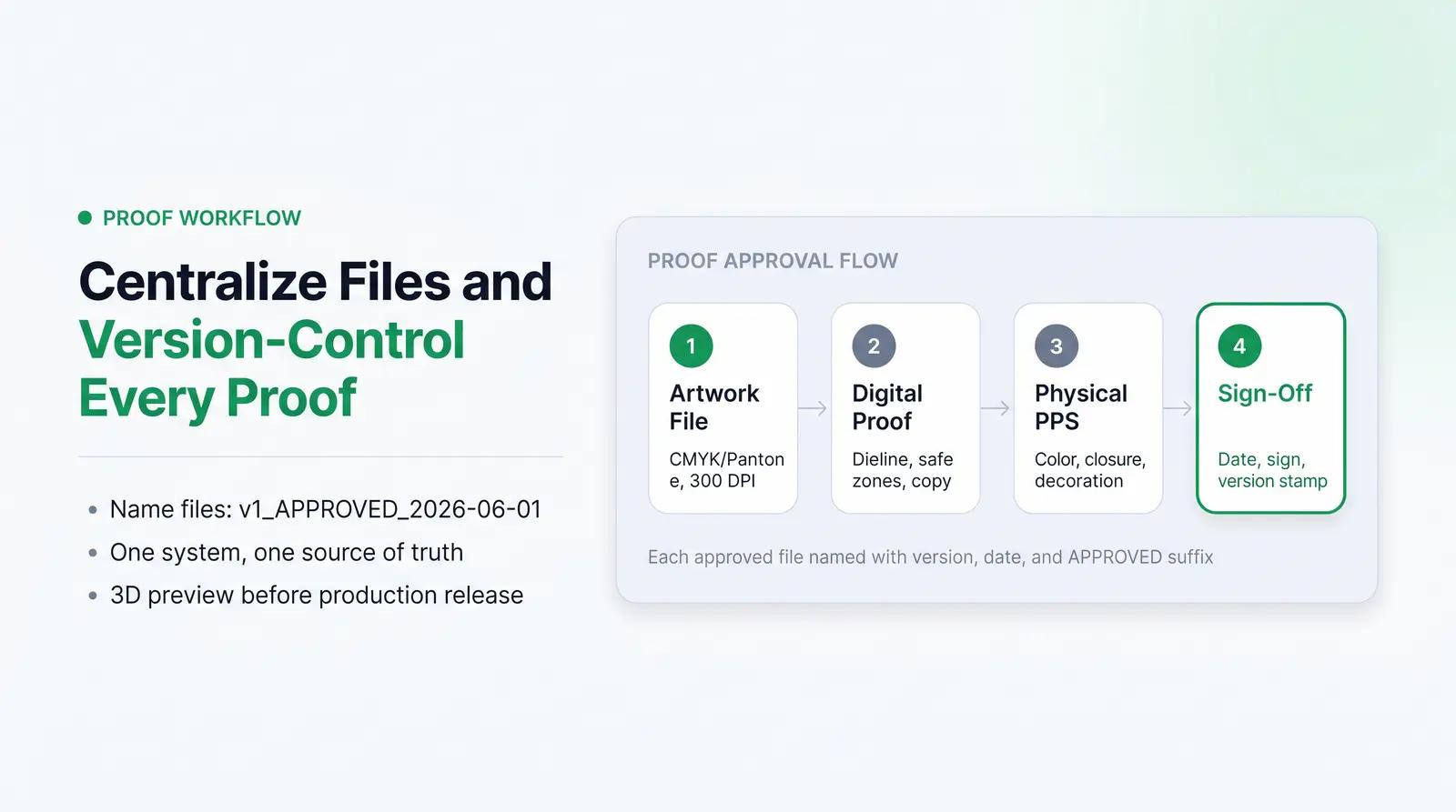
Managing digital files, physical samples, and supplier communication can quickly overwhelm a small team, especially when sourcing from overseas suppliers across multiple time zones. Centralizing the process and maintaining a clear version-control system, where each approved file is named with a version number, date, and "APPROVED" suffix, reduces the risk of sending the wrong file to production.
Packfolio's required 3D preview step in the order flow, where every custom order is previewed on a photorealistic 3D model before production is released, functions as a structured digital proof checkpoint. Every customer sees exactly how their artwork will appear on the physical container before a single unit is manufactured. Packfolio also coordinates physical sample review and production QA without the customer needing to manage supplier contact directly, removing the friction that typically delays proof cycles for independent brands.
Browse Packfolio's curated cosmetic packaging catalog, customize your artwork inside predefined print zones, and preview your label on a photorealistic 3D model before a single unit goes into production. Explore the catalog →
Frequently Asked Questions
What is the difference between a digital proof and a physical pre-production sample?
A digital proof is a digital file, typically a PDF, used to verify layout, spelling, dieline accuracy, and regulatory copy. A physical pre-production sample is an actual prototype used to test tactile feel, true color on the substrate, closure fit, and decoration durability. Both are required for first-time custom packaging orders.
What is an acceptable Delta-E tolerance for cosmetic packaging?
For critical brand colors on commercial packaging, a Delta-E of less than 2.0 is the standard acceptable tolerance. At this level, the color difference is generally imperceptible to a consumer viewing the product in isolation. A Delta-E above 3.5 is visible to most consumers and should be rejected for brand-critical colors.
Do I need to test closure torque on a filled or empty bottle?
You must always test closure torque and seal integrity on a container filled with your actual product. Testing on an empty container does not accurately simulate the physical pressures and potential lubrication effects of the product on the threads. The Method of Test for Closure Torque specifically requires testing on filled containers.
What font size is required for cosmetic ingredient lists on FDA-regulated labels?
Under FDA regulations at 21 CFR 701.3, the ingredient declaration must be conspicuous, with letters not less than 1/16 of an inch in height. If the total package surface available to bear labeling is less than 12 square inches, letters must not be less than 1/32 of an inch in height.
Why does my brand color look different on my physical proof than on my screen?
Screens emit light using RGB colors, while printers apply ink using CMYK or Pantone colors, creating a fundamental physical difference in how color is rendered. Additionally, the substrate absorbs ink and reflects light differently, causing the color to shift compared to a digital display. This is why physical proofs on the actual substrate are essential before approving production.
References
[1] Pacifica Beauty Turns Packaging Blunder into a Marketing Triumph. BeautyMatter. 2023. https://beautymatter.com/articles/how-pacifica-turned-a-typo-into-a-sustainability-campaign
[2] The Packaging Design Approval Process: Every Step, Role, and Checkpoint Explained. Confetti Design. 2026. https://www.confetti.design/blog/packaging-design-approval-process
[3] Understanding Clear Space and Label Bleeds. Wizard Labels. https://www.wizardlabels.com/blog/remember-clear-space-when-creating-labels/
[4] Trim, Bleed and Safe Zone: Printing Terms Explained. Handy Labels. https://www.handylabels.co.uk/support/bleed
[5] What Is Color Accuracy in Packaging? Pantone Matching, Delta E, and Why Brand Color Drifts. 3D Color. https://3dcolor.com/what-is-color-accuracy-in-packaging-pantone-matching-delta-e-and-why-brand-color/
[6] Color Control and Delta E in Label Production. ASAS Label. https://asaslabel.com/blog/color-control-delta-e-label-printing
[7] Color Difference Formula and ΔE: CIE Standards and Color Tolerance. Skychemi. 2025. https://skychemi.com/color-difference-formula-delta-e/
[8] Product Labeling Samples Process: Proceeding with Confidence. LabelOn. 2022. https://label-on.com/product-labeling-samples-process-proceeding-with-confidence/
[9] Cap Application Torque Specifications. Kinex Cappers. https://www.kinexcappers.com/faq/torque-guidelines.htm
[10] Cosmetic Tubes Hot-Stamping Decoration: Techniques, Materials, and Branding Benefits. Steba. https://steba.it/blogsteba/cosmetic-tubes-hot-stamping-decoration-techniques-materials-and-branding-benefits/
[11] Why Are the Colors Never Right in Packaging Printing? MJC Packaging. 2026. https://mjcpack.com/why-are-the-colors-never-right-in-packaging-printing/
[12] Modernization of Cosmetics Regulation Act of 2022 (MoCRA). U.S. Food and Drug Administration. 2026. https://www.fda.gov/cosmetics/cosmetics-laws-regulations/modernization-cosmetics-regulation-act-2022-mocra
[13] Summary of Cosmetics Labeling Requirements. U.S. Food and Drug Administration. 2025. https://www.fda.gov/cosmetics/cosmetics-labeling-regulations/summary-cosmetics-labeling-requirements
[14] MoCRA Cosmetic Label Requirements: The Essential Guide. Registrar Corp. 2024. https://www.registrarcorp.com/blog/cosmetics/mocra/mocra-cosmetic-label-requirements/
[15] From Typos to Misprints, Beauty Brand Founders Lament Label Mistakes. Beauty Independent. 2020. https://www.beautyindependent.com/from-typos-to-misprints-brand-founders-lament-label-mistakes/
[16] Packaging Decoration and Labeling: A Cosmetic Packaging Buyer's Guide. JPS Packaging. 2026. https://www.jpspackaging.com/blog/packaging-decoration-and-labeling


